Power Button
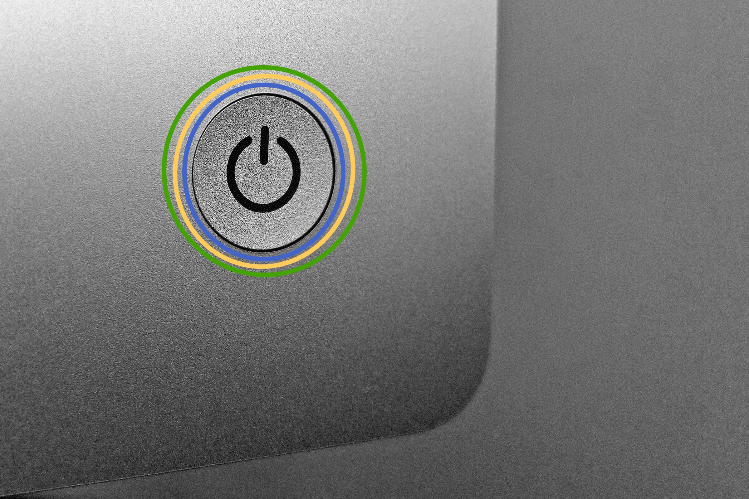
The electronic world is run by zeros and ones, so it makes sense that the power button — arguably the most important toggle on our gadgets and gizmos — is adorned with both. During World War II, engineers used “1” to mean “on” and “0” to mean “off.” If you look at some power strips, you’ll see that the glowing red power toggle is adorned with both a 0 and a 1. In 1973 the International Electrotechnical Commission codified a broken circle with a line in the middle as a “standby power state.” Today, that design is simply an emblematic stand-in for “power,” and devices still use the symbol half a century later.
Command Key
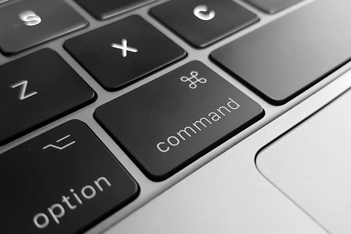
Glance at the keyboard of an Apple computer, and you’ll see a strange symbol denoting the command key. The original idea for the key — back when it was called the Apple key — was for it to allow users to navigate an Apple computer without a mouse, something that was much more common in the early 1980s before the era of trackpads. Annoyed by how many Apple logos appeared on the command list of the application MacDraw, Apple co-founder Steve Jobs allegedly proclaimed, “There are too many Apples on the screen! It’s ridiculous! We’re taking the Apple logo in vain!” and asked Apple’s bitmap artist Susan Kare to come up with a solution. While searching an international symbol directory, Kare came across the floral design then used in Scandinavian maps for attractions or places of cultural heritage. This simple yet effective design was just the thing Kare needed to symbolize the concept of “command.”
404 Error
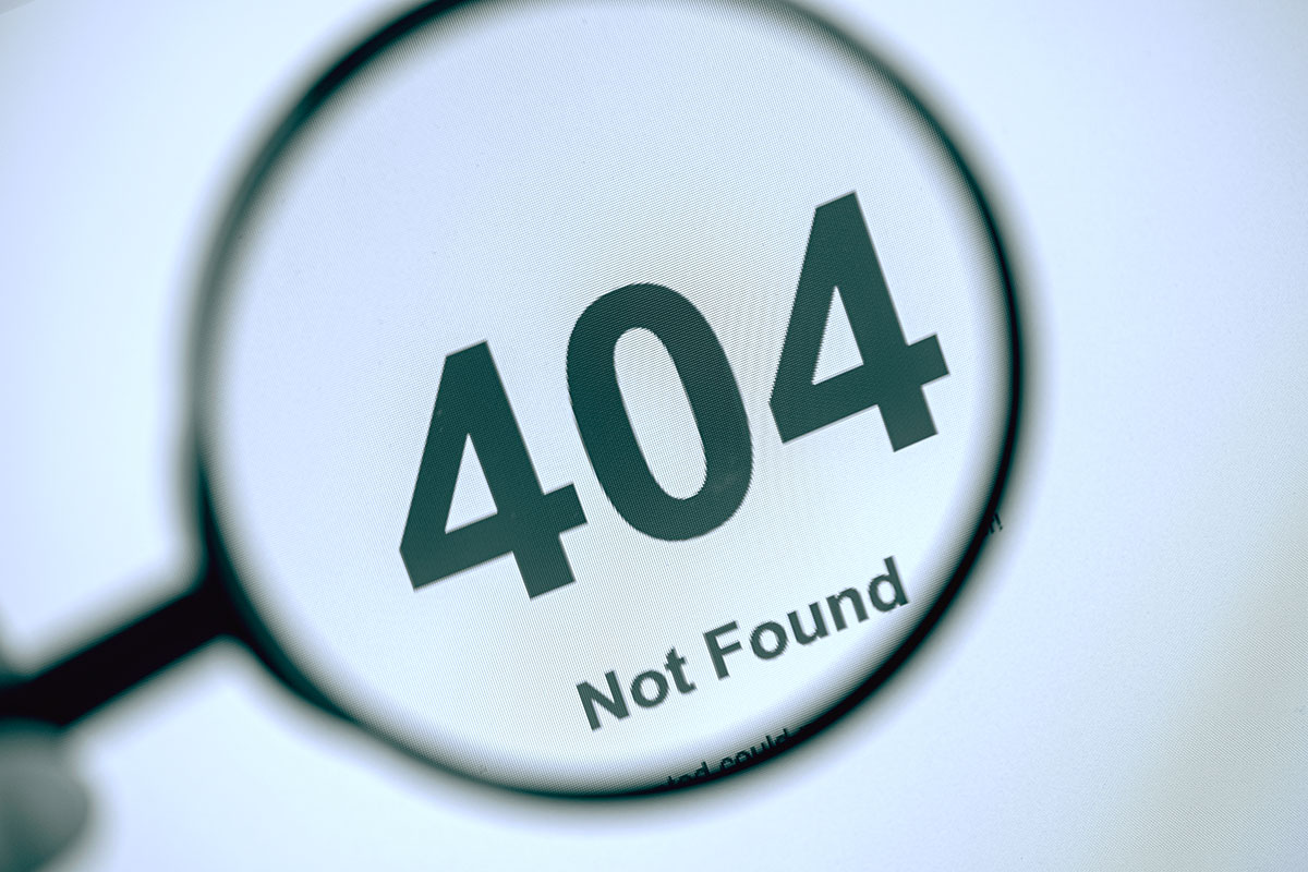
Just as zero was a major breakthrough in the world of mathematics, so too would the digital world be impossible without the 404 error. Early hypertext systems kept a centralized database of all links and where each link sent a user. If one link was updated, then the database was updated so links always led to their intended destination. But as the internet ballooned in size, keeping track of every link proved impossible. So Tim Berners-Lee, the inventor of the World Wide Web, came up with a solution — just don’t validate links. Instead, a broken link would display the dreaded 404 error. Codes starting with “4” refer to a user-side error, and “04” simply means requesting a nonexistent (or no longer existent) address. While the 404 error allowed the early internet to flourish, it also created a few problems, chief among them being “link rot” — which describes the general tendency for links to break over time. But like it or not, “404” is here to stay.
More Interesting Reads
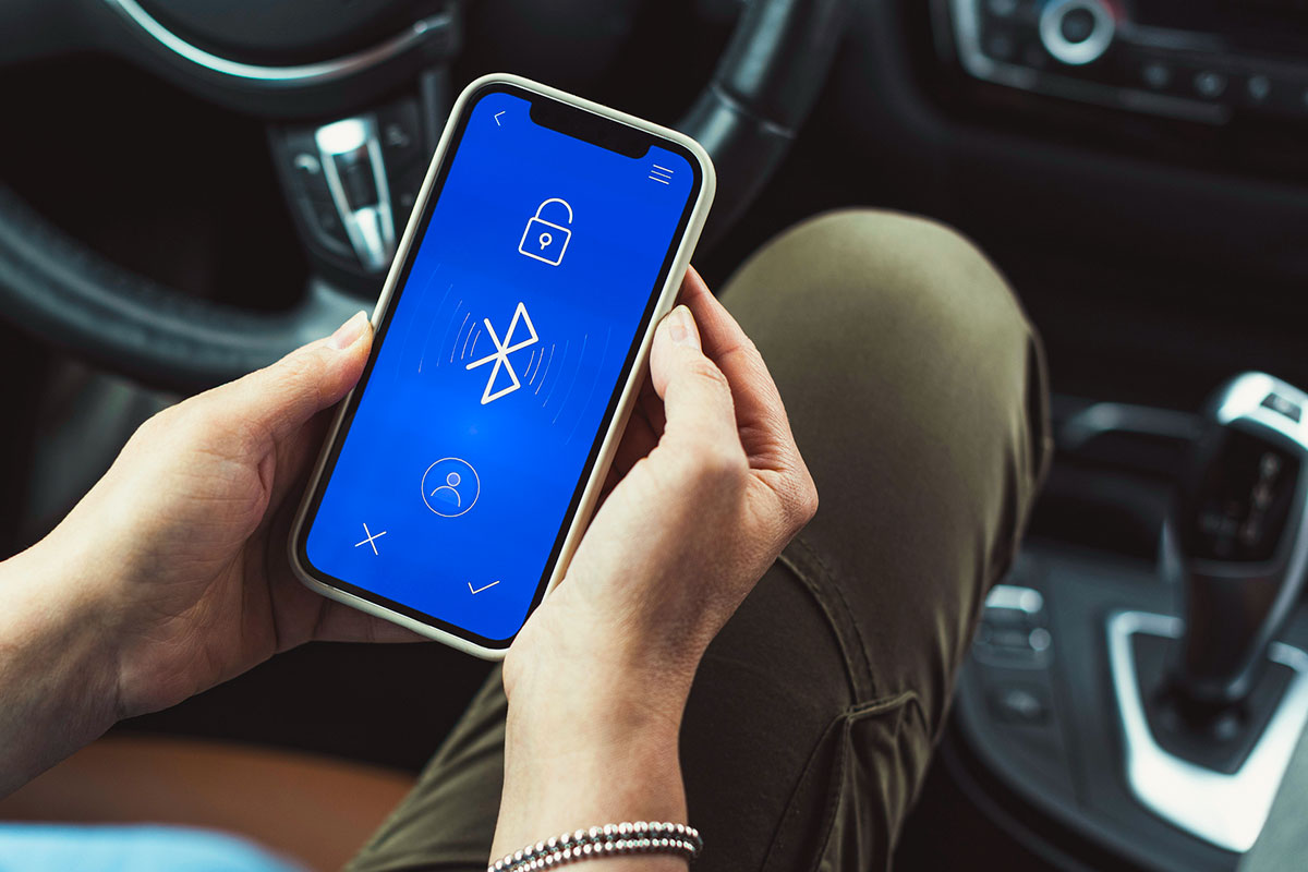
Bluetooth Icon
King Harald “Bluetooth” Gormsson ruled over Denmark and Norway in the 10th century, but he’d likely be surprised to learn that his name would instead be known for a short-range wireless technology invented more than a millennium later. Developed in 1994 by Dutch inventor Jaap Haartsen, Bluetooth gets its name from Gormsson’s famous nickname — a nod to his legendary dead “blue” tooth — but honoring Gormsson wasn’t a random hat tip to a historical king. When the three companies Intel, Ericsson, and Nokia met to create a wireless communication standard, Intel’s Jim Kardach suggested Bluetooth as a temporary code name, saying that “King Harald Bluetooth… was famous for uniting Scandinavia just as we intended to unite the PC and cellular industries with a short-range wireless link.” But the temporary code stuck, and the world-renowned symbol for the technology became a combination of the Scandinavian runes Hagall (ᚼ) and Bjarkan (ᛒ), which stand for the famous Viking king’s initials.

USB Symbol
Universal Serial Bus, or USB, has been through some changes since its debut in the mid-’90s. There’s USB 2.0, 3.0, and now Type-C (which has finally made its way to the iPhone). Such a powerful technology capable of connecting a variety of peripherals deserves an equally powerful symbol, so why not use Neptune’s trident? This divine pitchfork-inspired symbol has been around since the technology’s inception, and the different symbols at its three tips — a circle, square, and triangle — represent all the disparate technologies that can now be connected via the Universal Serial Bus.

Wi-Fi Sign
This ubiquitous wireless technology got its name when the Institute of Electrical and Electronics Engineers (IEEE) created the 802.11 standard that we now simply call Wi-Fi (a big improvement from the name “IEEE 802.11b Direct Sequence”). The Wi-Fi Alliance, which owns the Wi-Fi trademark, created a logo inspired by the yin-yang symbol from Chinese philosophy. This was a nod to the technology’s universal compatibility but also to its literal function — it existed yet it was invisible. But a practical symbol that conveyed the strength of that Wi-Fi connection had to translate the invisible into the visible, so the Wi-Fi signal symbol was created to express invisible electromagnetic waves, which propagate as radio waves to deliver wireless internet to your devices.

Play Button
Although many of these symbols have definitive beginnings, the play button’s exact origin story is a bit of mystery. What is known is that the symbol first appeared on reel-to-reel tape decks in the mid-1960s — the grandfather of the cassette tapes that ruled the ’80s (and are now making an unexpected comeback). Luckily, the reason for the play button is much more clear, as it simply points in the direction in which the tape moves.
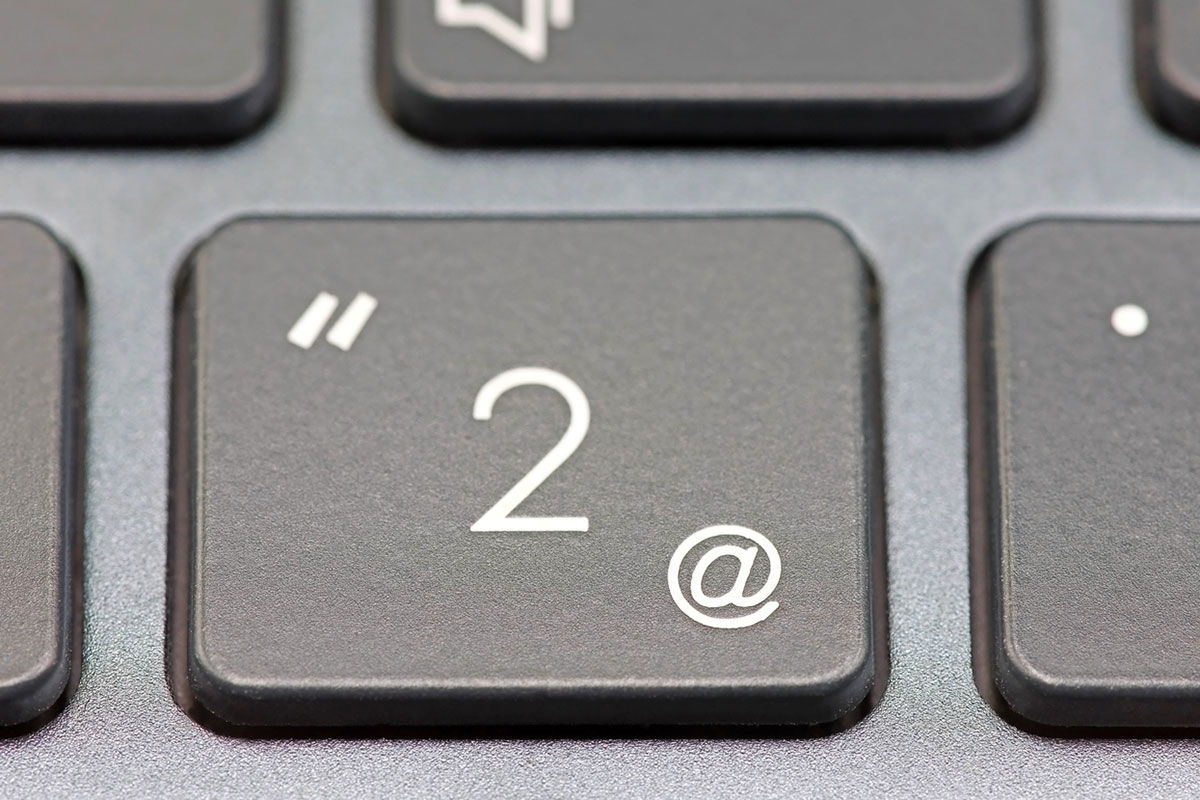
@ Symbol
While the rest of these icons have their foundations in the digital age, the @ symbol is an emblem from the medieval era that almost fell into obscurity. Although scholars debate where the @ symbol originated — some say medieval monks invented it while looking for handwriting shortcuts — its first definitive use arrived in the mid-16th century, and merchants often used the symbol to communicate buying rates (bananas @ $1, for example). However, the information age eschewed the @ symbol, and it almost disappeared entirely until 1971, when Bolt, Beranek and Newman (BBN) programmer Raymond Tomlinson decided to use the neglected symbol to separate users and terminals in computer network addresses — or what we today call “email.”
“I was mostly looking for a symbol that wasn’t used much,” he once told the Smithsonian. “And there weren’t a lot of options.” With the more recent addition of the symbol in social media handles, the reign of “@” is strong.

