Original photo by PA Images/ Alamy Stock Photo
They say a picture is worth a thousand words, and if you ask any marketing expert, that adage applies to brand logos as well. Symbols such as McDonald’s golden arches and the Olympic rings represent more than just the brands behind them — they also embody the circumstances that led to the emblem’s conception.
Some of these crests represent larger societal trends, while others were chosen for their striking aesthetic nature. Let’s take a look at six fascinating backstories behind some of the world’s most recognizable brand logos.
The Olympics
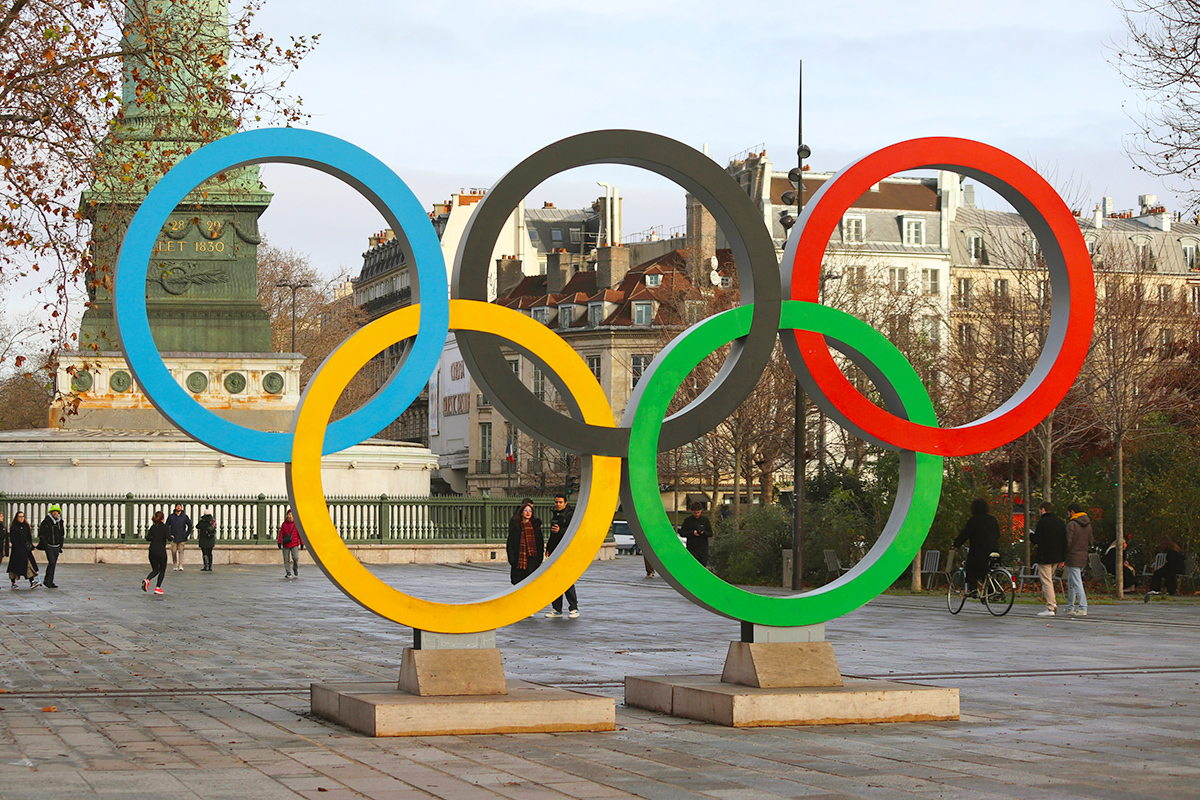
Whether flown on flags or tattooed onto an athlete’s body, the Olympic rings are among the world’s most familiar symbols. The five colorful, interlocking rings are the brainchild of Pierre de Coubertin — a man who helped organize the first modern Olympiad in 1896.
The first set of Olympic rings was hand-drawn and colored by de Coubertin, who debuted the logo at the top of a letter he’d written in 1913. The symbol’s meaning was expounded upon in the August edition of the Olympic Review that same year.
A translation of the original French reads, “These five rings represent the five parts of the world now won over to Olympism,” referencing Olympic participants from Africa, the Americas, Asia, Europe, and Oceania. The six colors (black, blue, green, red, yellow, and the white background) were chosen because they represented the flag colors of every competing nation at the time.
The rings were formally added to the official Olympic flag when it was created in Paris in 1914, though the ensuing 1916 Berlin Games were canceled due to World War I. The logo finally made its formal debut at the 1920 Antwerp Games and has remained ever since.
Guinness
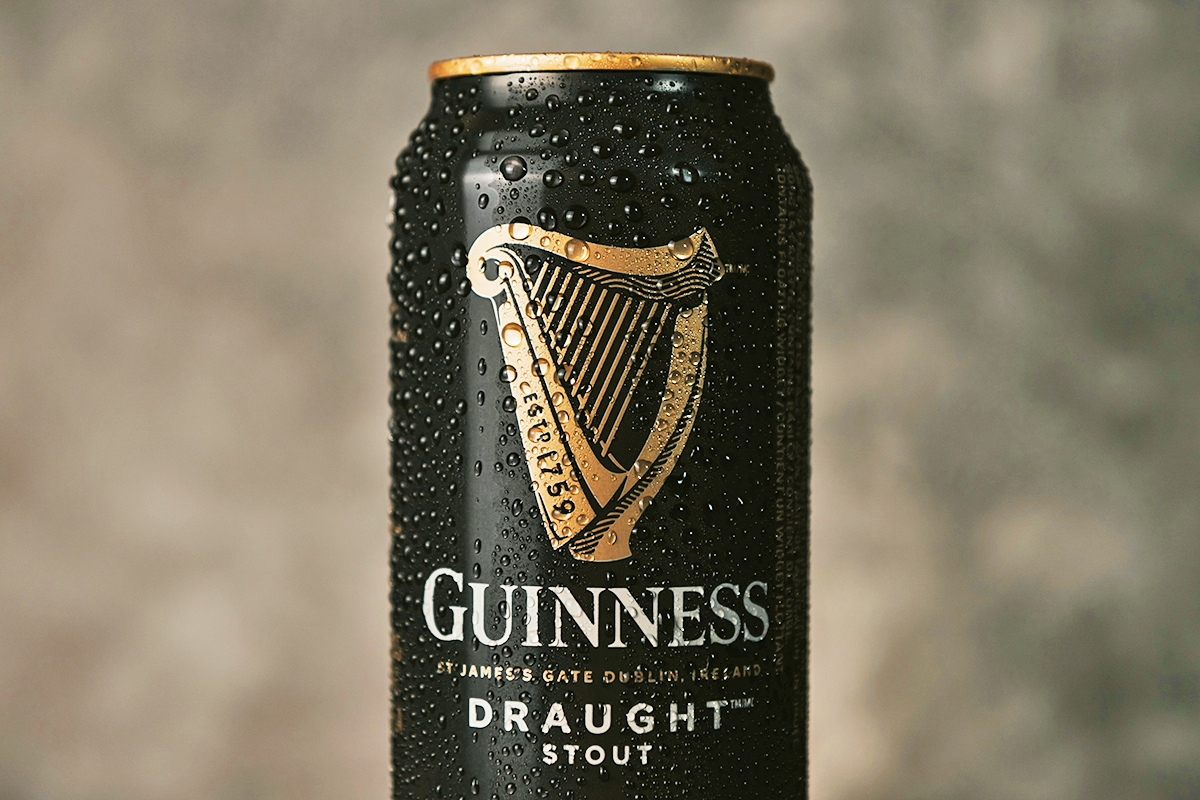
The Trinity College harp has been on display at its namesake school in Dublin since 1782, though its history dates back much earlier. The harp was once thought to have been owned by the legendary Brian Boru — the former High King of Ireland who died in battle in 1014 — and the instrument became widely regarded as a proud symbol of the Irish people (even though more recent evidence suggests there’s no connection between Boru and the medieval-era harp). This harp was thus selected by Guinness as their brand logo.
Guinness was founded in 1759 and began to export its popular stout beer before the end of the century. In an effort to ensure everybody knew the beer was an authentically Irish product, Guinness adopted the harp as its logo in 1862. It later trademarked the harp in 1876 — the first year trademark registration began in the United Kingdom, which Ireland belonged to at the time.
When the Irish Free State was established in 1922, it also featured the harp on its Great Seal. However, since Guinness had already trademarked the logo, the Irish Free State was forced to flip the harp so it faced the other way and therefore complied with trademark regulations. This remains the case, and if you examine the harp on a Guinness glass, you’ll see it faces the opposite direction from the harp depicted on Irish coins.
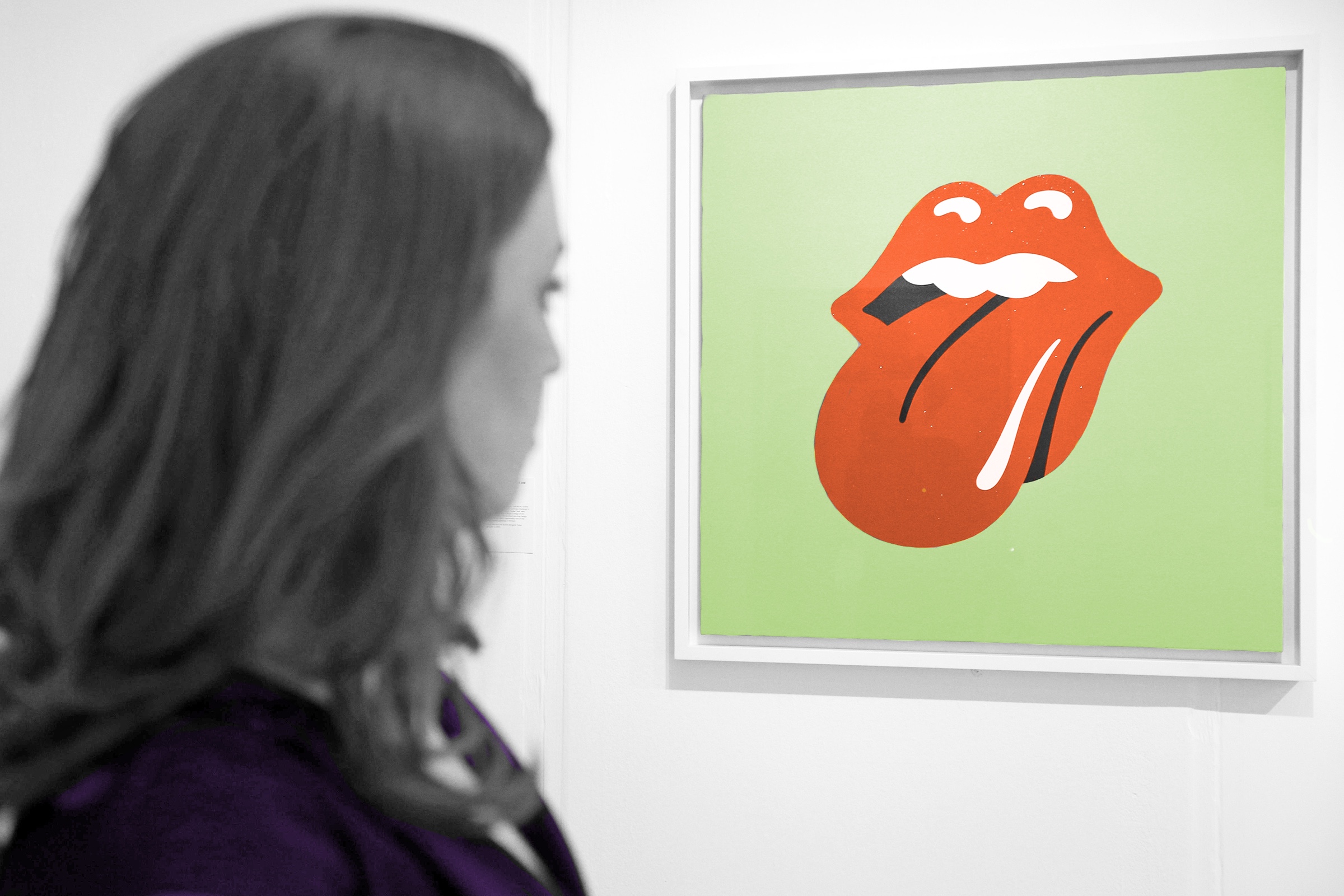
The Rolling Stones
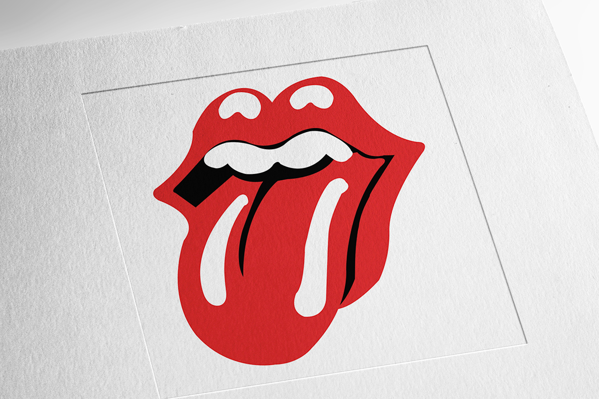
Graphic designer John Pasche was a 25-year-old art student at London’s Royal College of Art when he created an iconic rock ’n’ roll symbol: the bright red tongue and lips used as the logo of the Rolling Stones. In a 2016 interview with the Victoria & Albert Museum, Pasche explained that in 1970, the school received a call from the band asking for a recommendation for someone who could help design a tour poster (not the logo Pasche would later become famous for).
At the school’s suggestion, Pasche met with lead singer Mick Jagger, and after a lukewarm first attempt, he created a design that ended up being to Jagger’s liking, featuring a cruise liner, Concorde jet, vintage car, and other elements related to the touring lifestyle.
Based on that initial success, Pasche was also commissioned to create a band logo. In a subsequent meeting with Jagger, the singer presented Pasche with a clipping he’d picked up in a local corner shop. It depicted the Hindu goddess Kali — a powerful figure boasting a pointed red tongue — and Jagger said it was just the type of thing he liked.
Pasche was drawn to Kali’s bright red mouth and tongue and spent two weeks sketching out a few concepts. One was the now-iconic lips and tongue, which Jagger and his fellow bandmates approved. Pasche was paid £50 (about $1,344 USD today) for his creation, and the logo debuted as an insert in the 1971 album Sticky Fingers. When asked to respond to rumors that the logo was based on Jagger’s own prominent set of lips, Pasche told Radio X, “It wasn’t initially, but it might have been something that was unconscious.”
More Interesting Reads


Lacoste
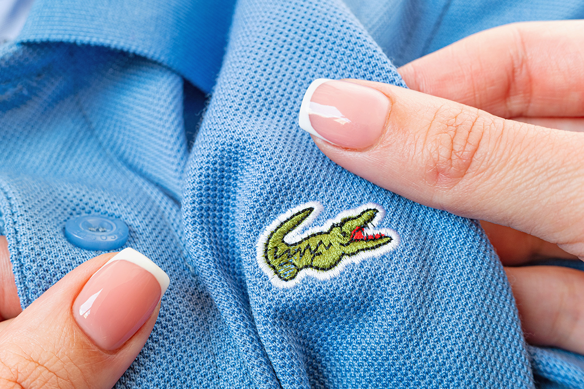
Crocodiles aren’t native to France, which may make you wonder why the worldwide fashion brand Lacoste uses the reptilian creature as its logo. It all has to do with founder and namesake René Lacoste, who was a world-class tennis champion before becoming a fashion mogul. His nickname “the Crocodile” ultimately inspired the brand’s emblem.
The nickname itself came about in 1923, when sports journalist George Carens wrote about Lacoste’s performance at a Davis Cup match in Boston, writing in the Boston Herald Traveler, “He fought like a real crocodile … and never gave up on his prey.”
According to Carens’ grandson, the nickname was partially inspired by not just his playing style, but also by a possibly apocryphal story that made waves and caught the journalist’s ear at the time. It’s said that the 19-year-old Lacoste made a bet with his team captain, in which Lacoste was promised a crocodile-skin suitcase if he won a big match. Lacoste welcomed the moniker, saying it “highlighted my tenacity on the tennis court,” according to the International Tennis Hall of Fame.
The crocodile logo was brought to life in 1927 by Lacoste’s friend and artist Robert George, when it was sewn onto a blazer Lacoste frequently wore. When the brand was founded in 1933, the crocodile was featured prominently in advertising campaigns and sewn atop the left breast of the company’s popular polo shirts.
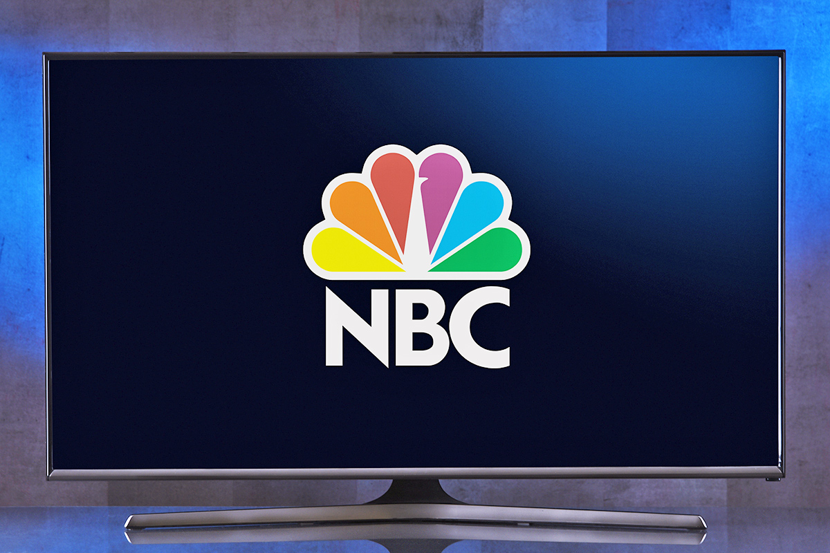
NBC
From its founding in 1926 to the 1950s, NBC employed the use of several primarily black-and-white logos that were minimalistic in nature. But in the 1950s, the TV industry shifted away from black-and-white programming toward color, and in turn, NBC unveiled a series of colorful logos, including one that incorporated one of the more flamboyant and colorful creatures in the animal kingdom: the peacock.
NBC’s first peacock logo debuted in 1956, having been created by artistic director John J. Graham and a team of fellow designers. Graham and others believed the colorful logos would help capture viewers’ attention.
As the story goes, symbols such as rainbows and butterflies were initially considered, though ultimately they were deemed too simple. It’s said that Graham’s wife, Candella, is the one who helped him land on a peacock. The bird is still the network’s mascot today, but the original differed slightly from the current logo, as it featured 11 colorful feathers back then (compared to six now).
The peacock logo disappeared in 1975 but returned in a slightly altered form with new colors in the early 1980s. The original image had red, orange, yellow, green, blue, and purple colors, and the updated version had dark red, orange, gold, blue, indigo, and violet instead.
In 1986, the number of feathers was dropped from 11 to six, with each of the six new colors representing a different element of NBC: yellow for news, orange for sports, red for entertainment, purple for radio, blue for network, and green for production. This was the last major update for the peacock, which has remained largely unchanged ever since.
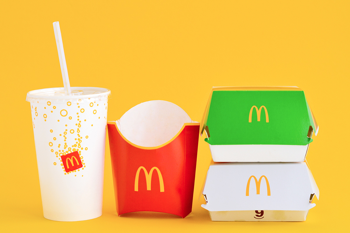
McDonald’s
In 1952, Dick and Mac McDonald were discussing plans for the first-ever McDonald’s franchise location. Dick believed incorporating two bright yellow, half-circle arches into the building’s design could help catch the eye of passing motorists, and an architect named Stanley Clark Meston agreed.
Those inaugural arches were created by sign maker George Dexter and debuted on the sides of the first McDonald’s franchise in Phoenix, Arizona. The arches were installed on opposite ends of the building and looked like two upside-down “U’s” rather than one interlocked “M.” But when viewed from a certain angle, the arches appeared as though they interlocked, which influenced the logo’s eventual creation.
When Ray Kroc purchased McDonald’s from its namesake brothers in 1961, he was interested in rapid expansion, which he believed required a recognizable logo. Jim Schindler — the company’s head of engineering and design — sketched out an idea that he based on the Phoenix location’s look. That rudimentary logo incorporated two interwoven arches as well as a slanted line cutting through them to represent the restaurant’s sloping roof.
In 1968, the slanted line was removed and the arches were moved inches apart, forming the golden arches logo we know today. There was a brief time when Kroc thought about doing away with the logo altogether, but he was told to keep it by psychologist and brand consultant Louis Cheskin. Cheskin claimed the logo subliminally communicated a nurturing message to the customer base, as it represented “mother McDonald’s breasts” — a comment purportedly overheard by Davis Masten, who once ran the consulting firm Cheskin started.

Bennett Kleinman is a New York City-based staff writer for Inbox Studio, and previously contributed to television programs such as "Late Show With David Letterman" and "Impractical Jokers." Bennett is also a devoted New York Yankees and New Jersey Devils fan, and thinks plain seltzer is the best drink ever invented.
top picks from the Inbox Studio network
Interesting Facts is part of Inbox Studio, an email-first media company. *Indicates a third-party property.