Original photo by Anthony Lee/ iStock

From the orange glow of a sunrise to the calming tones we choose to paint our bedrooms, color shapes the way we experience the world. It influences our moods, choices, and memories, and it adds a layer of emotional depth to everything we see.

Yet you may be surprised to learn that colors, despite being such an important part of the human experience, aren’t universally perceived the same way. Two people may look at the same object and experience the color differently, depending on various factors such as how their eyes and brains process light. Those variations remind us that the colors we take for granted are filtered through biology and culture, making our experience of the world more unique than we might realize.

Credit: VisualStories/ iStock

How We Perceive Color

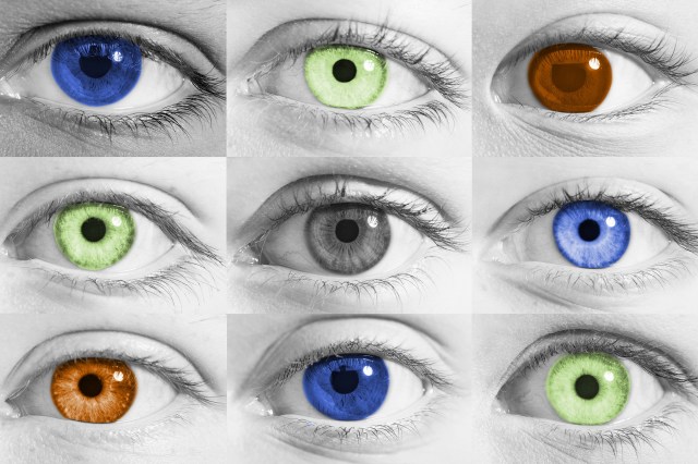
Color perception begins in the eye, specifically with the retina’s photoreceptor cells called cones. Humans typically have three types — S-cones, M-cones, and L-cones — that detect short, medium, and long wavelengths, roughly corresponding to blue, green, and red light. Those cones send signals to the brain, where they are interpreted as the colors we see.

However, not everyone’s eyes perceive color the same way. Color vision deficiencies, often called color-blindness, affect millions around the world — roughly one in 12 men and one in 200 women — shaping how they experience color. 

Red-green color-blindness makes it hard to pick out reds and greens, sometimes muting them or making them indistinguishable from each other. Less common forms include blue-yellow deficiencies, which blur blues, greens, yellows, and reds, and monochromacy (achromatopsia), which eliminates color entirely, causing people to see the world in shades of black, white, and gray.

Even subtle differences in cone distribution can alter perception. Two people gazing at the same sunset could describe it differently — one emphasizing the reds and oranges, the other noticing more purples and pinks.

Aging also plays a role: As the eye’s lens yellows over time, it begins to filter out blue light, lending colors a warmer, more muted tone. After cataract surgery, patients often report the world looking brighter or more vivid, a reminder of how physical changes in the eye affect what we perceive.

Credit: kudou/ IStock

Color Perception Is Subjective and Changeable

Our brains’ interpretations of color aren’t fixed — they’re dynamic and easily influenced by context. One reason for this is a phenomenon called color constancy, which is the brain’s ability to recognize the same color under different lighting conditions. 

For example, a white shirt appears white in both sunlight and indoor lighting, even though the wavelengths reaching the eyes are very different. The brain adjusts for the light source, maintaining a consistent sense of color rather than shifting in hue.

Optical illusions, however, reveal the limits of color constancy. The viral internet phenomenon known as “the dress” — wherein some people saw a photo of a blue and black dress while others saw white and gold — shows how assumptions about lighting and shadow can completely alter our perception of color. 

In that case, viewers unconsciously “corrected” for what they thought the light source was, leading to dramatically different interpretations of the same image. This is the same principle filmmakers relied on in The Wizard of Oz.  The sudden burst of saturated color found in the Land of Oz feels especially vivid because our brains contrast it against the monochrome tones of the Kansas scenes.

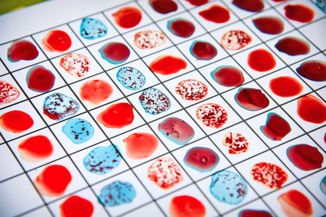
Our everyday perceptions are just as personal. When choosing fruit at the grocery store, we use subtle color cues — such as the shift in hue from green to yellow in a banana or the deepening red of a ripe strawberry — to judge freshness. Some people focus more on saturation (how intense a color appears) rather than brightness (how light or dark the color seems), but both are part of how the brain interprets color in context. 

Even our physical and emotional states can change how we see color. Fatigue can dull our sensitivity to contrast, certain medications can change how light is processed by the retina, and mood has even been shown to influence perception: People with a positive mindset often perceive colors as slightly more vivid.

Credit: colnihko/ iStock

Our Understanding of Color Perception Is Limited

Even with advances in science, one puzzle remains: our inner experiences of color. The “inverted spectrum” thought experiment, which dates back to at least the 17th century and philosophers including John Locke, imagines a scenario in which one person’s red may appear to them as another person’s green, even though both call it “red.” 

This is a philosophical concept rather than a scientific claim, meant to illustrate the limits of our knowledge about subjective experience. Because we can’t step into another person’s perception, we can never know for certain how their colors compare to ours — or if two people truly experience the same hue the same way, even if they both call it “red.”

We know color perception involves a number of physical and psychological factors, but research is still uncovering just how personal and varied it can be. Genetics and neuroscience show that differences in our eyes and brain pathways shape our perception of the colors we see. Brain imaging studies reveal how the visual cortex interprets color, and experiments with color-blind individuals show how adaptable our brains can be to different ways of seeing.  

While we may never be able to fully view the world through someone else’s eyes, studying color perception can help us understand the fascinating mix of biology, culture, and consciousness that allows us to experience the world in our own unique ways.  

Kristina Wright
Writer

Kristina is a coffee-fueled writer living happily ever after with her family in the suburbs of Richmond, Virginia.

Original photo by Album/ Alamy Stock Photo

What’s the greatest movie ever made? It depends who you ask, of course, but a handful of movies tend to come up every time the question arises. We all have our favorites, some of which are more personal than others, and you could dedicate the rest of your moviegoing life to watching your way through the various lists and polls without managing to see every worthwhile title. 

Short of that, you could focus on the all-timers that have emerged as consensus picks for the greatest of all time. Here are 11 of them, each of which is worth its runtime in gold. 

For similar articles, subscribe to our sister brand Movie Brief, brought to you by our resident film critic Michael Nordine. You’ll receive a weekly review and recommendation of a new movie, whether in theaters or available to stream, as well as a list of 25 must-see movies when you first sign up.

Credit: Allstar Picture Library Ltd/ Alamy Stock Photo

City Lights (1931)

You can’t tell the story of cinema without Charlie Chaplin, whose Little Tramp remains one of the most enduring silver-screen characters ever created. A bittersweet romp in which the Tramp falls in love with a blind woman who works at a flower shop, it’s best remembered for what many (including yours truly) consider the best movie ending of all time.

Credit: Allstar Picture Library Limited/ Alamy Stock Photo

Gone With the Wind (1939)

Still the highest-grossing movie of all time when adjusted for inflation, Gone With the Wind has been rereleased, reappraised, and rewatched more than any film ever made. You could argue, as many have, that Victor Fleming’s epic Civil War drama is an antiquated relic that belongs in a museum rather than a movie theater, but you can’t deny its influence. 

In one of the earliest polls of its kind, Variety asked more than 200 film industry professionals to name the best film ever made. Gone With the Wind topped that list, as it has many others — albeit not recently, as its reputation has withered with age.

Credit: Allstar Picture Library Ltd/ Alamy Stock Photo

The Rules of the Game (1939)

Perhaps no country takes cinema more seriously than France, which has produced countless masterpieces since George Méliès and the Lumière brothers helped innovate the “seventh art” in the 1890s. At the top of that mountain of movies would have to be Jean Renoir’s The Rules of the Game, a tragicomic parable for the inevitable-in-hindsight leadup to World War II. 

No other movie has snagged a spot in the top 10 of Sight and Sound’s decennial poll of the greatest movies in history for all of its six editions: 1952, 1962, 1972, 1982, 1992, 2002, and 2012. It’s also been named the greatest French film ever made by Time Out, which, while accurate, is also somehow limiting — like the global conflict it presaged, The Rules of the Game transcends boundaries.

Credit: cineclassico/ Alamy Stock Photo

Citizen Kane (1941)

“Seeing it,” film critic Archer Winsten wrote of Citizen Kane when it was first released, “it’s as if you never really saw a movie before.” More than 80 years later, Orson Welles’ all-timer has lost none of its power. 

A true before-and-after moment in cinema, Citizen Kane marked the arrival of one of the most skilled, idiosyncratic filmmakers in Hollywood history: Welles produced, directed, co-wrote, and starred in his debut feature, which famously did not win Best Picture but has since gone on to be named the greatest movie ever made on countless occasions. You have to see it to believe the hype.

Credit: World History Archive/ Alamy Stock Photo

Casablanca (1942)

“If there is ever a time when they decide that some movies should be spelled with an upper-case M,” Roger Ebert wrote in the introduction to his list of the 10 greatest movies ever made, “Casablanca should be voted first on the list of Movies.” 

The Library of Congress seems to agree, as Michael Curtiz’s World War II drama was added to the National Film Registry’s inaugural class in 1989. It also won the Academy Awards for Best Picture, Director, and Screenplay following its initial release. If you still haven’t seen it, it’s time to do so at least once, for old times’ sake.

Credit: RGR Collection/ Alamy Stock Photo

Tokyo Story (1953)

The films of Yasujirō Ozu are quiet in their profundity, like a wise relative whose lessons you don’t fully understand until reconsidering them as an adult. There’s no wrong way to start with his imposing filmography, but there’s only one zenith: Tokyo Story, a moving family drama about an elderly couple who come to stay with their adult children in Japan’s capital. It’s sad, transportive, and, according to 359 directors, the greatest movie ever made.

Credit: Pictorial Press Ltd/ Alamy Stock Photo

Seven Samurai (1954)

Many people’s initial reaction to a black-and-white Japanese movie from the 1950s with a runtime of 207 minutes may be that it sounds like a chore, but in this case, nothing could be further from the truth. Akira Kurosawa’s Seven Samurai is an epic in the truest sense of the word, a thrillingly melancholy exploration of honor, duty, and a bygone way of life that has proved one of Japanese cinema’s most enduring backdrops. (It also invented the assembling-the-team trope that has since been endlessly repeated ever since.) 

You could populate an entire best-of list just with Kurosawa pictures alone, but Seven Samurai remains his most expansive, fully realized work — hence why it’s been hailed as everything from the greatest foreign-language film to the greatest action movie of all time. 

Credit: Allstar Picture Library Limited/ Alamy Stock Photos

Vertigo (1958)

It took six decades for Citizen Kane to be dethroned on the aforementioned Sight and Sound poll. When that finally happened in 2012, Alfred Hitchcock’s Vertigo was the usurper. 

The kind of thriller only the Master of Suspense could have made stars Jimmy Stewart and Kim Novak as a former detective and the woman he becomes obsessed with, respectively. In addition to creating the eponymous dolly zoom that’s since become ubiquitous, Vertigo is a poignant thriller about the many ways a person can be haunted.

Credit: Allstar Picture Library Ltd/ Alamy Stock Photo

2001: A Space Odyssey (1968)

Sci-fi can be divided into two categories: 2001: A Space Odyssey and everything else. Stanley Kubrick’s sprawlingly ambitious odyssey remains the genre’s peak more than half a century later. Though there’s still no true consensus as to what the ending means, there is a consensus among nearly 500 filmmakers that 2001 is the greatest movie of all time.

Credit: Collection Christophel/ Alamy Stock Photo

The Godfather (1972)

Named the greatest movie ever made by Entertainment Weekly and the second-greatest American movie by the American Film Institute, The Godfather is also heavily favored by countless dads, uncles, and grandfathers across the world. 

No amount of praise can convey the sheer power of Marlon Brando and Al Pacino’s performances or of Francis Ford Coppola’s direction, all of which have become measuring sticks for greatness that few have met and fewer, if any, have surpassed in the decades since.

Credit: TCD/Prod.DB/ Alamy Stock photo

Jeanne Dielman, 23 quai du Commerce, 1080 Bruxelles (1975)

There’s a reason the Sight and Sound poll has been mentioned so many times: It’s considered the list of all lists, and the one that Roger Ebert himself called “by far the most respected of the countless polls of great movies — the only one most serious movie people take seriously.” 

And, in its 2022 edition, a surprising champion emerged: Chantal Akerman’s Jeanne Dielman, 23 quai du Commerce, 1080 Bruxelles, whose mouthful of a title is matched by a nearly 3.5-hour runtime. Most scenes consist of little more than the title character, a widowed housewife played by Delphine Seyrig in an era-defining performance, completing household tasks in real time until finally erupting in a shocking act of violence. 

It’s among the first feminist films as well as a “slow cinema” forerunner, and many would refer to it as a cult classic that’s finally begun to get its flowers on a larger scale. It’s a must-see for anyone willing to expand their conception of what a movie can do.

Michael Nordine
Staff Writer

Michael Nordine is a writer and editor living in Denver. A native Angeleno, he has two cats and wishes he had more.

Original photo by joruba/ iStock

Zen gardens are a treasured facet of Japanese culture. The neatly raked gravel, carefully placed stones, and sparse design is instantly relaxing — fitting, since the gardens were developed to encourage quiet reflection. 

Today, Zen gardens aren’t just found at historic temples; they’ve made their way into residential home landscaping and there are even miniature versions for your desktop. But no matter the size or location, the purpose is the same: to give the mind space to slow down and enter a meditative state. Here’s a closer look at how that works.

Credit: GCShutter/ iStock

A Minimalist Landscape

Japanese Zen gardens — which are only so called outside Japan; in Japan they’re known as karesansui, or “dry landscapes” — date back about a thousand years. Early Zen gardens were inspired by the rock gardens of China’s Song Dynasty, wherein stones were placed to mimic mythological mountains, while sand or gravel were meant to evoke water features. 

After Zen Buddhism was introduced to Japan around the 12th century, Buddhist temples began incorporating elements from karesansui into their designs. By the 14th century, dry landscape gardens had become a defining feature of temple grounds in Japan.

Unlike the country’s lush pond gardens or foliage-filled tea gardens, Zen gardens strip the landscape down to its fundamentals: gravel, rocks, and occasionally sparse plantings. The gravel is carefully raked into patterns that mimic rippling water, while stones suggest islands or mountains. The purposefully simplified structure gives the mind room to wander and imagine, focusing on the subtle details rather than chaos around you.

Credit: John S Lander/ Lightrocket via Getty Images

Inviting Meditation

These gardens aren’t just about aesthetics. Zen Buddhism emphasizes mindfulness, simplicity, and impermanence, with meditation at its core. Zen gardens were designed to embody those principles and to invite a meditative state. 

Empty spaces or raked indentations represent the Buddhist notion of emptiness, the view that things have no fixed nature and exist only in relation to one another.  Carefully placed rocks reflect the Buddhist idea that while things may appear solid, they are ultimately fleeting, helping visitors reflect on life’s impermanence without clinging to things. Meanwhile, flowing lines in the sand conjure mental images of water and the movement of the natural world.

The act of raking itself is also a form of movement-based meditation, cultivating patience and awareness of the present moment. Some of the most famous gardens, such as Kyoto’s Ryōan-ji, with its 15 carefully placed stones, or Kennin-ji’s subtemple Seirai-in and its white sand depicting drifting clouds, demonstrate those principles through minimalism, asymmetry, and abstraction, creating spaces that encourage reflection without distraction. Zen gardens are a living lesson in simplicity and presence.

Credit: Moment via Getty Images

The Science of Calm

Zen gardens aren’t just spiritually soothing — they also have real effects on the mind and body. Environmental psychology studies have shown that being in and observing nature can reduce stress, lower blood pressure, and improve focus. 

The minimalism of Zen gardens also contributes to their calming effect. Architect and Zen garden expert Mira Locher explains that the Japanese concept of yohaku no bi, or the beauty of blankness, is a defining aspect of the Zen garden. Uncluttered visuals help quiet the mind and foster meditation.

Those wide-open, minimal spaces give the eye and mind room to rest. Observing asymmetry can help us slow down and notice subtle details. The smooth, flowing lines in raked gravel, meanwhile, echo the visual complexity of natural patterns, which the brain interprets as harmonious, helping reduce stress

Credit: Fiordaliso/ Moment via Getty Images

Mini Zen Gardens, Major Relaxation

Most of us, of course, don’t have a sprawling temple courtyard at home. But Zen gardens can be created and benefitted from even in small spaces. Even tiny desktop Zen gardens offer a similar sense of calm. 

Raking sand or arranging stones with your hands can provide a soothing tactile sensory experience. It’s a small-scale reminder that slowing down, even for a few minutes, can reset the mind, improve focus, and help reduce the endless noise and mental clutter of modern life. 

Nicole Villeneuve
Writer

Nicole is a writer, thrift store lover, and group-chat meme spammer based in Ontario, Canada.

Original photo by urbazon/ iStock

Human beings have an extraordinary way of turning emotions into visible expressions. A burst of joy can light up the face with a smile, while a wave of sadness leaves our eyes brimming with tears. These physical reactions are caused by the remarkable relationship between the brain and body. 

When we experience emotions, a cascade of chemical signals and nerve impulses activates muscles and glands, producing observable expressions. Over millions of years of human evolution, these reactions have developed not only as individual responses but also as tools for social connection, signaling our inner state to those around us.

But why do certain physical reactions correspond to certain emotions? Why do the corners of our mouths lift up when we’re happy, and salty tears roll down our cheeks when we’re sad? The answers reveal a lot about the design of our nervous system, and the deeply social nature of human beings.

Credit: nopparit/ iStock

It All Starts With the Limbic System

At the heart of both smiling and crying lies the brain’s emotional control center: the limbic system. This network, which includes the amygdala, hippocampus, and hypothalamus, serves as a switchboard for our feelings. 

When we experience joy, the limbic system triggers activity in the brain’s reward circuits, releasing dopamine, serotonin, and endorphins. Those chemicals signal the muscles in the face, through cranial nerves, to contract in a way that forms a smile.

Sadness activates the same brain region, but in a different way. In this case, the amygdala and hypothalamus respond by activating the autonomic nervous system, which influences tear production. The lacrimal glands just above our eyes receive the signal and respond by producing emotional tears distinct from reflex tears (the kind that protect the eyes from dust or onions). 

In both scenarios, the limbic system is the unseen conductor, arranging expressions that not only reflect how we feel but also how we communicate it to the outside world.

Credit: Fly View Productions/ iStock

Smiling Developed as a Social Tool

Smiling primarily involves the facial muscles, especially the zygomaticus major, which lifts the corners of the mouth. A genuine, involuntary smile — known as a Duchenne smile — also engages the orbicularis oculi muscles around the eyes, creating the crinkling effect that distinguishes true happiness from a polite grin. These smiles are triggered by the brain’s release of “feel-good” neurotransmitters including dopamine and serotonin, reinforcing pleasurable experiences.

Interestingly, the act of smiling can actually create a positive feedback loop in the brain. Psychologists have found when we smile, even if by force, it can trick the brain into releasing more dopamine and reinforce the sense of happiness. This is known as the facial feedback hypothesis, the idea that our expressions don’t just reflect emotions but can also help generate them.

From an evolutionary perspective, smiles likely developed as a social tool. A smile can signal friendliness, cooperation, or safety, helping people build social bonds. In early human societies, this would have strengthened trust and encouraged group cohesion — an essential advantage for survival.

Credit: digitalskillet1/ Adobe Stock

How Crying Helps Us

Crying when we’re sad may feel like a loss of control, but it’s a deeply human response. Emotional tears differ from basal tears (also called continuous tears), which keep our eyes lubricated or the reflex tears that flush out irritants. Emotional tears contain higher levels of stress hormones such as cortisol, as well as endorphins that help stabilize your mood after crying.

This process begins in the hypothalamus, which detects emotional stress and sends signals to the parasympathetic nervous system. The lacrimal glands then produce tears, while the orbicularis oculi muscles contract around the eyes. Crying slows breathing and lowers heart rate, allowing the body to shift into a calmer state — a built-in form of self-soothing.

Like smiling, crying also has a strong social function. Tears are a nonverbal signal to others that we’re in need of comfort, support, or empathy, and studies show people are more likely to approach and console someone who is visibly crying. This social response likely explains why humans evolved the capacity for emotional tears — something no other animal seems to have.

Credit: guruXOOX/ iStock

Humans Evolved To Smile and Cry

Beyond individual biology, emotional expressions have deep evolutionary roots due to the social purposes they serve. Our friendly smiles and vulnerable tears promote group cohesion and mutual support to this day, but they were also vital for early human survival.

Research shows that emotional expressions are instinctive rather than learned. Babies smile and cry long before they can speak, suggesting these behaviors are hardwired. And cross-cultural studies confirm people around the world recognize basic emotions through facial expressions — even when factoring in cultural differences in how emotions are expressed — highlighting the universal biology at play here.

Throughout human history, evolution likely favored individuals who could effectively convey emotions to their community, ensuring understanding and cooperation within their groups.

Credit: pixdeluxe/ iStock

Emotional Expressions Are Crucial

In modern life, our emotional expressions continue to serve important purposes. Smiling when we’re happy can strengthen our personal relationships, improve our mood, and even influence how others perceive us, while crying when we’re sad can provide relief and foster empathy. Brain imaging studies show observing a smile or tears can activate similar regions in the observer’s brain, demonstrating how expressions promote emotional connection.

In these ways, our face becomes more than just a reflection of your inner state — it also sends messages to others around us, reinforced by millions of years of evolution.

Kristina Wright
Writer

Kristina is a coffee-fueled writer living happily ever after with her family in the suburbs of Richmond, Virginia.

Original photo by Julia_Sudnitskaya/ iStock

Weather affects nearly every aspect of our daily lives  — from what we wear to how we travel and even how farmers plan their crops. Predicting the weather, however, is one of the most complex challenges in science, requiring large networks of satellites and sensors feeding information into powerful computers to mirror the dynamics of the ever-changing atmosphere. While it may seem like forecasting tomorrow’s rain or sunshine is a simple guess, it’s actually the result of careful analysis of data gathered from around the globe.

Modern weather forecasting blends centuries-old observation methods with cutting-edge technology. From satellites orbiting the Earth to sensors placed deep in the ocean, meteorologists track countless variables that influence the atmosphere. Those variables — including temperature, air pressure, wind, humidity, and more — interact in complex ways, creating the constantly shifting weather patterns that forecasters must interpret.

Credit: Наталья Босяк/ Adobe Stock

Farmer’s Almanacs

Long before scientific forecasting, people relied on folklore, observation of the skies, and seasonal almanacs to anticipate weather. The Old Farmer’s Almanac, first published in 1792, used a formula that was said to include solar activity, weather patterns, and astronomical cycles. 

Farmers and households turned to it for long-range forecasts, sometimes with uncanny accuracy, but just as often with results no better than chance. Folk sayings such as “red sky at night, sailor’s delight. Red sky in morning, sailor’s warning,” based on observations passed down through generations, also acted as early weather guides.

While those early methods provided some rough counsel, they lacked the precision we expect today. Weather forecasting as a true science began in the mid-19th century, when telegraph systems allowed rapid sharing of weather observations across regions, enabling the first warnings of approaching storms. Still, predictions in those days were only reliable a few hours in advance.

Credit: milehightraveler/ iStock

Observation

Today, the first step in predicting weather is gathering data. Meteorologists monitor the atmosphere using a combination of ground-based instruments, weather balloons, satellites, and radar. Ground stations measure temperature, humidity, wind speed, and air pressure in specific locations. Weather balloons carry instruments called radiosondes high into the atmosphere, providing readings of conditions at various altitudes. 

Each observation provides a piece of the larger puzzle. For example, a sudden drop in air pressure can indicate an approaching storm, while wind patterns help predict where weather systems will move next. Collecting this data continuously from hundreds of thousands of points on Earth allows meteorologists to track the ever-changing atmosphere with remarkable detail.

Credit: morrismedia/ iStock

Modern Tools

Satellites and radar are essential tools for modern meteorology. Weather satellites were first launched in the 1960s, giving meteorologists a powerful new tool for weather observation. As they orbit the Earth, satellites provide continuous images and measurements regarding factors such as cloud cover, temperature, humidity, and wind at different altitudes. Some can even measure rainfall and detect severe storms including hurricanes or typhoons before they reach populated areas.

Radar systems complement satellites by offering detailed, real-time information about precipitation. Doppler radar in particular can measure the speed and direction of rain droplets, allowing meteorologists to detect rotation in storms, which is a key factor in predicting tornadoes. By combining satellite imagery, radar data, and surface observations, forecasters can track storms as they develop and issue timely warnings to protect lives and property.

Credit: Petrovich9/ iStock

Creating a Weather Model

Once data is collected, meteorologists turn to computer-based weather models to make sense of it. These models are mathematical simulations of the atmosphere that use physics and fluid dynamics to predict how weather systems will evolve. Essentially, the models take current conditions and calculate how they’re likely to change over time, producing forecasts that can range from a few hours to several days ahead.

There are many types of weather models, each with their own strengths. Some are global, simulating weather across the entire planet, while others are regional, focusing on a specific area for more precise predictions. 

Small changes in the atmosphere can have large ripple effects on the weather, so forecasters often run multiple models and compare results to find the most likely outcome. This process, called ensemble forecasting, helps account for uncertainty and increases the reliability of predictions.

Credit: gorodenkoff/ iStock

Turning Data Into Forecasts

After collecting data and running models, meteorologists interpret the results to create forecasts for the public. They consider model predictions, historical patterns, and the effects of local geographic features, such as mountains or large bodies of water, which can influence local weather. While computers run billions of calculations, it’s human expertise that ensures the final forecast adjusts for uncertainties and translates complex data into useful information. 

Forecasts are usually presented as probabilities, such as a 70% chance of rain, to reflect the atmosphere’s unpredictability. Short-term forecasts can be highly accurate, sometimes down to the hour, while long-range forecasts beyond a week are less reliable. 

Still, accuracy has improved dramatically over the past few decades due to our evolving technology: A seven-day forecast today being as accurate as a three-day forecast was in the 1980s. According to the National Oceanic and Atmospheric Administration (NOAA), today’s five-day forecasts are accurate about 90% of the time, while seven-day forecasts are correct about 80% of the time. 

Kristina Wright
Writer

Kristina is a coffee-fueled writer living happily ever after with her family in the suburbs of Richmond, Virginia.

Original photo by wwing/ iStock

From fire trucks to big dogs named Clifford, certain things are inseparable from the color red. That category of objects also includes barns, which are painted red more often than they are any other hue. 

This isn’t a coincidence — there’s a pragmatic reason for this decision that originated in Europe and was later brought to the Americas by early settlers. But over time, painting barns red became less of a practical choice and more of a pastoral tradition among farmers. Without further ado, let’s take a look at the origins of this colorful trend and its continued prevalence in modern agriculture.

Credit: Arterra/ Universal Images Group via Getty Images

Early European Origins

The tradition of deliberately painting pastoral structures red is believed to have derived — at least in part — from a practice that originated in 16th-century Sweden. At that time, it was common to construct cottages and even castles out of wood, which was a readily available resource. 

But many northern European nobles, including Sweden’s King John III, admired the Gothic-era brick structures that were so common in the Netherlands. In an effort to emulate that desirable reddish brick aesthetic, the king issued a 1570s mandate to apply a coat of red paint to two wooden castles in Stockholm and Turku. This was possible thanks to paint dyed with iron oxide (rust), which was used to create a reddish pigment.

The iron oxide came from a famous ninth-century copper mine located in Falun. The mine collapsed in 1687, but even though mine operators could no longer access any precious ore, they still had enough waste byproduct available to manufacture red paint. This led to a rise in the production of red paint throughout the 18th century, and use of the color permeated society. 

Given its earlier association with nobility, many Swedes considered the color red to be a proud part of the country’s overall identity, and they used the paint to coat their pastoral cottages in the countryside. Those people also noticed red paint provided practical benefits, as its chemical makeup helped preserve those cottages against the harsh Nordic climate. 

So while the practice of painting barns red may have begun as a status symbol, it helped maintain pastoral structures in practice. This brings us to how it became such a popular choice among American farmers.

Credit: KenWiedemann/ iStock

The Science Behind Red Barns

As European settlers migrated to the Americas, they brought many traditions with them across the ocean. Those included painting barns and other pastoral structures red, which, as the Swedes had learned, also turned out to have scientific benefits for the many American farmers who continued this practice.

As barns were raised across American farms, weather damage proved to be a major concern. Barns were subjected to harsh winds and torrential rain, and the risk of mold growth further complicated things. In an effort to ensure their barns’ durability, many farmers turned to red paint as a protective varnish.

This emerged as a particularly common practice throughout 18th-century New England. Farmers relied on a mixture whose main ingredient was linseed oil — a brownish-orange sealant that hydrated the wood and offered protection from the elements. Lime and milk were also added to help the oil stick to the barn. 

But the striking red color came from the addition of reddish iron oxide, also known as rust, which acts as a natural poison for any fungi, mold, moss, or other similar growths that could cause wooden barns to decay.

With this in mind, farmers sourced rust from the old tools and weatherworn equipment found on so many farms. Once mixed with linseed oil, milk, and lime, it created the ideal varnish to protect against weather and decay, thus helping to keep barns standing for years to come. 

So while the Swedes may have used red paint as a symbol of status that just so happened to come with additional practical benefits, almost the opposite was true of American farmers who lacked the connection to Swedish nobility. For Americans, the preservative nature of red paint was far and away the most important factor, and the picturesque red color just so happened to be an aesthetically pleasing perk that accompanied it.

Credit: Liudmila Chernetska/ iStock

A Cost-Effective Choice

As weatherproofing technology developed, farmers relied less on homemade mixtures to preserve their barns. But red continued to be a popular choice for painting barns because of its low cost compared to other paint colors. 

In the U.S., “ready-mixed” paints were made available by 1867, and commercialization expanded rapidly throughout the remainder of the 19th century. During this period, it proved to be cheapest for manufacturers to produce red paint, as the pigment was easier to acquire at a lower cost. For proof of this, look no further than the 1922 Sears Roebuck catalog: The cost of a gallon of red paint was just $1.43 (roughly $27.50 today), making it far cheaper than other hues at the time, which cost $2.25 or more per gallon.

Though preventing decay and keeping costs low were top of mind, farmers discovered painting their barns red came with other benefits. 

For instance, some noted that red barns stayed warmer in the winter, as the darker red tones better absorbed sunlight than lighter shades of paint. Red barns also provided better visibility, as they stood out against the tones of the surrounding natural landscape. This was especially useful in the winter or during storms, when visibility was lower than normal.

Credit: Ric Matkowski/ Unsplash

A Continued Tradition

Long gone are the days of relying on iron oxide to kill fungi or of red paint being notably cheaper than alternative colors. So why are so many barns still painted red today? Well, for some, the answer lies solely in tradition.

Many farmers view red-colored barns as a proud symbol of their heritage and the many hardworking individuals who preceded them. Not only that, but red barns also stand out and look good. So while you’re bound to see barns painted white, green, and a variety of other colors, red remains a popular choice steeped in tradition.

Bennett Kleinman
Staff Writer

Bennett Kleinman is a New York City-based staff writer for Inbox Studio, and previously contributed to television programs such as "Late Show With David Letterman" and "Impractical Jokers." Bennett is also a devoted New York Yankees and New Jersey Devils fan, and thinks plain seltzer is the best drink ever invented.

Original photo by PA Images/ Alamy Stock Photo

They say a picture is worth a thousand words, and if you ask any marketing expert, that adage applies to brand logos as well. Symbols such as McDonald’s golden arches and the Olympic rings represent more than just the brands behind them — they also embody the circumstances that led to the emblem’s conception. 

Some of these crests represent larger societal trends, while others were chosen for their striking aesthetic nature. Let’s take a look at six fascinating backstories behind some of the world’s most recognizable brand logos.

Credit: Nathan Cima/ Unsplash

The Olympics

Whether flown on flags or tattooed onto an athlete’s body, the Olympic rings are among the world’s most familiar symbols. The five colorful, interlocking rings are the brainchild of Pierre de Coubertin — a man who helped organize the first modern Olympiad in 1896. 

The first set of Olympic rings was hand-drawn and colored by de Coubertin, who debuted the logo at the top of a letter he’d written in 1913. The symbol’s meaning was expounded upon in the August edition of the Olympic Review that same year. 

A translation of the original French reads, “These five rings represent the five parts of the world now won over to Olympism,” referencing Olympic participants from Africa, the Americas, Asia, Europe, and Oceania. The six colors (black, blue, green, red, yellow, and the white background) were chosen because they represented the flag colors of every competing nation at the time.

The rings were formally added to the official Olympic flag when it was created in Paris in 1914, though the ensuing 1916 Berlin Games were canceled due to World War I. The logo finally made its formal debut at the 1920 Antwerp Games and has remained ever since.

Credit: Matt Brett/ Unsplash

Guinness

The Trinity College harp has been on display at its namesake school in Dublin since 1782, though its history dates back much earlier. The harp was once thought to have been owned by the legendary Brian Boru — the former High King of Ireland who died in battle in 1014 — and the instrument became widely regarded as a proud symbol of the Irish people (even though more recent evidence suggests there’s no connection between Boru and the medieval-era harp). This harp was thus selected by Guinness as their brand logo.

Guinness was founded in 1759 and began to export its popular stout beer before the end of the century. In an effort to ensure everybody knew the beer was an authentically Irish product, Guinness adopted the harp as its logo in 1862. It later trademarked the harp in 1876 — the first year trademark registration began in the United Kingdom, which Ireland belonged to at the time.

When the Irish Free State was established in 1922, it also featured the harp on its Great Seal. However, since Guinness had already trademarked the logo, the Irish Free State was forced to flip the harp so it faced the other way and therefore complied with trademark regulations. This remains the case, and if you examine the harp on a Guinness glass, you’ll see it faces the opposite direction from the harp depicted on Irish coins.

Credit: Renan/ Adobe Stock

The Rolling Stones

Graphic designer John Pasche was a 25-year-old art student at London’s Royal College of Art when he created an iconic rock ’n’ roll symbol: the bright red tongue and lips used as the logo of the Rolling Stones. In a 2016 interview with the Victoria & Albert Museum, Pasche explained that in 1970, the school received a call from the band asking for a recommendation for someone who could help design a tour poster (not the logo Pasche would later become famous for).

At the school’s suggestion, Pasche met with lead singer Mick Jagger, and after a lukewarm first attempt, he created a design that ended up being to Jagger’s liking, featuring a cruise liner, Concorde jet, vintage car, and other elements related to the touring lifestyle.

Based on that initial success, Pasche was also commissioned to create a band logo. In a subsequent meeting with Jagger, the singer presented Pasche with a clipping he’d picked up in a local corner shop. It depicted the Hindu goddess Kali — a powerful figure boasting a pointed red tongue — and Jagger said it was just the type of thing he liked.

Pasche was drawn to Kali’s bright red mouth and tongue and spent two weeks sketching out a few concepts. One was the now-iconic lips and tongue, which Jagger and his fellow bandmates approved. Pasche was paid £50 (about $1,344 USD today) for his creation, and the logo debuted as an insert in the 1971 album Sticky Fingers. When asked to respond to rumors that the logo was based on Jagger’s own prominent set of lips, Pasche told Radio X, “It wasn’t initially, but it might have been something that was unconscious.”

Credit: Evgen/ Adobe Stock

Lacoste

Crocodiles aren’t native to France, which may make you wonder why the worldwide fashion brand Lacoste uses the reptilian creature as its logo. It all has to do with founder and namesake René Lacoste, who was a world-class tennis champion before becoming a fashion mogul. His nickname “the Crocodile” ultimately inspired the brand’s emblem.

The nickname itself came about in 1923, when sports journalist George Carens wrote about Lacoste’s performance at a Davis Cup match in Boston, writing in the Boston Herald Traveler, “He fought like a real crocodile … and never gave up on his prey.” 

According to Carens’ grandson, the nickname was partially inspired by not just his playing style, but also by a possibly apocryphal story that made waves and caught the journalist’s ear at the time. It’s said that the 19-year-old Lacoste made a bet with his team captain, in which Lacoste was promised a crocodile-skin suitcase if he won a big match. Lacoste welcomed the moniker, saying it “highlighted my tenacity on the tennis court,” according to the International Tennis Hall of Fame.

The crocodile logo was brought to life in 1927 by Lacoste’s friend and artist Robert George, when it was sewn onto a blazer Lacoste frequently wore. When the brand was founded in 1933, the crocodile was featured prominently in advertising campaigns and sewn atop the left breast of the company’s popular polo shirts.

Credit: monticellllo/ Adobe Stock

NBC

From its founding in 1926 to the 1950s, NBC employed the use of several primarily black-and-white logos that were minimalistic in nature. But in the 1950s, the TV industry shifted away from black-and-white programming toward color, and in turn, NBC unveiled a series of colorful logos, including one that incorporated one of the more flamboyant and colorful creatures in the animal kingdom: the peacock.

NBC’s first peacock logo debuted in 1956, having been created by artistic director John J. Graham and a team of fellow designers. Graham and others believed the colorful logos would help capture viewers’ attention.

As the story goes, symbols such as rainbows and butterflies were initially considered, though ultimately they were deemed too simple. It’s said that Graham’s wife, Candella, is the one who helped him land on a peacock. The bird is still the network’s mascot today, but the original differed slightly from the current logo, as it featured 11 colorful feathers back then (compared to six now).

The peacock logo disappeared in 1975 but returned in a slightly altered form with new colors in the early 1980s. The original image had red, orange, yellow, green, blue, and purple colors, and the updated version had dark red, orange, gold, blue, indigo, and violet instead. 

In 1986, the number of feathers was dropped from 11 to six, with each of the six new colors representing a different element of NBC: yellow for news, orange for sports, red for entertainment, purple for radio, blue for network, and green for production. This was the last major update for the peacock, which has remained largely unchanged ever since.

Credit: monticellllo/ Adobe Stock

McDonald’s

In 1952, Dick and Mac McDonald were discussing plans for the first-ever McDonald’s franchise location. Dick believed incorporating two bright yellow, half-circle arches into the building’s design could help catch the eye of passing motorists, and an architect named Stanley Clark Meston agreed. 

Those inaugural arches were created by sign maker George Dexter and debuted on the sides of the first McDonald’s franchise in Phoenix, Arizona. The arches were installed on opposite ends of the building and looked like two upside-down “U’s” rather than one interlocked “M.” But when viewed from a certain angle, the arches appeared as though they interlocked, which influenced the logo’s eventual creation.

When Ray Kroc purchased McDonald’s from its namesake brothers in 1961, he was interested in rapid expansion, which he believed required a recognizable logo. Jim Schindler — the company’s head of engineering and design — sketched out an idea that he based on the Phoenix location’s look. That rudimentary logo incorporated two interwoven arches as well as a slanted line cutting through them to represent the restaurant’s sloping roof.

In 1968, the slanted line was removed and the arches were moved inches apart, forming the golden arches logo we know today. There was a brief time when Kroc thought about doing away with the logo altogether, but he was told to keep it by psychologist and brand consultant Louis Cheskin. Cheskin claimed the logo subliminally communicated a nurturing message to the customer base, as it represented “mother McDonald’s breasts” — a comment purportedly overheard by Davis Masten, who once ran the consulting firm Cheskin started.

Bennett Kleinman
Staff Writer

Bennett Kleinman is a New York City-based staff writer for Inbox Studio, and previously contributed to television programs such as "Late Show With David Letterman" and "Impractical Jokers." Bennett is also a devoted New York Yankees and New Jersey Devils fan, and thinks plain seltzer is the best drink ever invented.

Original photo by Eric Han/ Unsplash

Cats and humans have coexisted for thousands of years. In fact, this mutually beneficial relationship emerged between 10,000 and 15,000 years ago, when humans transitioned from hunting and gathering to farming. They needed help controlling rodent populations in their crops, and cats found a steady food source in field mice. 

This was the start of a beautiful human-animal camaraderie, a bond that eventually grew so strong some humans have even been buried with their furry pals. One of the earliest known human-cat burials was discovered in a 9,500-year-old grave in Cyprus (where cats are not native), highlighting their early domestication.

Since then, cats have become beloved companions, now living in more than 30% of U.S. households. Despite their popularity, there’s still much to discover about our feline friends, from deciphering their signature “meows” to revealing instincts inherited from their wild ancestors. Here are eight fascinating facts about cats.

Credit: Byrdyak/ iStock

They’re Divided Into Two Categories: Roarers and Purrers

The Felidae family, comprising all 37 species of felines, is divided into two subfamilies: Pantherinae (commonly known as the “big cats”), which includes lions, tigers, and leopards; and Felinae, which encompasses smaller species such as cougars, bobcats, and domestic cats. Cats within the Pantherinae family roar, while members of the Felinae family purr.

Those vocal differences are due to structural variations in and around the vocal cords. Felinae species have an extra layer of fatty tissue that allows their vocal cords to vibrate at low frequencies, producing a purr. By contrast, Pantherinae cats have tough cartilage at the base of their throats, which prevents purring but gives the larynx the flexibility needed to produce a roar. A lion’s roar measures around 114 decibels — far louder than the average housecat’s 25-decibel purr.

Credit: vladans/ iStock

They Meow Mainly To Communicate With Humans

Domestic cats meow for many reasons — to greet, complain, or request — but interestingly, they primarily do it only around humans. This behavior originates in kittenhood, when young cats meow to get their mother’s attention. As they grow, they take this behavior into adulthood but repurpose it to interact with their human companions.

Animal behavior psychologist Dr. John Wright explained in an interview with Live Science that cats use vocal communication to manipulate their humans. Cats choose meowing over other forms of interaction because humans’ senses aren’t as finely tuned as theirs, meaning we can’t communicate as easily through smell or touch; their meowing elicits the greatest response from us.

Different meows serve different purposes. For example, a short, high-pitched “meow” may be a simple greeting, while a longer, more urgent “mrroooow” may signal hunger or danger. And domestic cats aren’t the only species that use meowing to communicate: Larger cats such as snow leopards, cheetahs, cougars, and even lion cubs also meow occasionally, mostly to locate each other or, in the case of young cats, to request food or affection.

Credit: Dennis Frates/ Alamy Stock Photo

There Are 73 Recognized Cat Breeds

The International Cat Association (TICA) is a genetic registry for pedigreed cats and is one of the world’s largest sanctioning bodies for cat shows. As of 2025, TICA officially recognizes 73 breeds of domestic cats, each with unique characteristics, mannerisms, and aesthetics, from the ancient Abyssinian breed to the water-loving Turkish Van.

One of the newest recognized breeds is the Highlander, a cross between the Desert Lynx (bred to resemble a bobcat) and the Jungle Curl (known for its curled ears). Weighing between 10 and 20 pounds, this muscular breed is playful and affectionate, boasting the size of its wild ancestors without their aggression.

Credit: Hakase_. iStock

The “Beckoning Cat” Brings Good Luck in Japan

Often depicted as a white or calico cat with one paw raised, the maneki-neko (“beckoning cat”) is a popular Japanese figurine believed to bring good fortune or prosperity. In stark contrast to Western superstition, even black maneki-neko are considered lucky in Japan.

There are various origin stories, but one popular legend hails from Tokyo’s Gōtokuji Temple during the Edo period (1603 to 1868). According to temple historians, a feudal lord was saved from being struck by lightning by a cat named Tama, who beckoned him into the safety of the temple just in time. In gratitude, the lord made the cat a temple patron. Today, thousands of maneki-neko statues are displayed in Tama’s honor.

Credit: Janina Delissen/ iStock

All But One Species Have Retractable Claws 

Retractable claws are a defining feature of most cat species. When unsheathed, claws are valuable tools for defense and hunting. Both big and small cats — from lions to housecats — share this trait. However, one species breaks the mold: the cheetah.

Cheetahs have semi-retractable claws that remain at least partially extended at all times, similar to those of dogs. Their claws are also somewhat blunt, providing better grip and traction, akin to an athlete’s cleats. This helps cheetahs achieve speeds of more than 70 mph. Their unique paw pads (which are hard like rubber) and long tails also aid in maneuverability while sprinting.

Credit: EyeEm Mobile GmbH/ iStock

Housecats Are Crepuscular

Domestic cats are active at dawn and dusk, making them crepuscular animals. This natural rhythm helps explain the daytime napping habits of housecats, which sleep an average of 10 to 13 hours a day, conserving energy for their instinctual “hunt” during twilight hours. This habit is the result of millions of years of evolution. 

In the wild, other species of cats also exhibit crepuscular or nocturnal behaviors, depending on their environment and hunting patterns. For instance, leopards are typically nocturnal and do most of their hunting at night.

Cats have evolved to thrive in low-light conditions; they require a mere one-sixth of the illumination levels humans need to see well. Moreover, their distinctly shaped pupils dilate up to 135 times their smallest size, maximizing light intake. Cats’ eyes also feature a layer of cells behind the retina called the tapetum lucidum, which reflects ambient light, further enhancing night vision and giving cats their iconic “glowing” eyes in the dark. 

Credit: Bogdan Kurylo/ iStock

They Spend up to 50% of Their Time Doing This One Thing

Domestic cats spend up to half their waking hours grooming themselves, a behavior that has both health and social benefits. Their barbed tongues clean away dirt, dust, dead skin cells, and other debris, which is why cats generally don’t need to be bathed by their owners. Undomesticated cats frequently groom themselves as well, because it removes odors that could attract predators in the wild.

Grooming also plays a key role in cats’ social behaviors. They often groom each other in a bonding behavior known as “allogrooming,” which is observed in many mammalian species, including chimpanzees. You may even find your cat licking you — not just for attention, but as a sign of affection. As a bonus, grooming is soothing for cats, helping them self-regulate stress after experiences such as visits to the veterinarian or time away from their human companions.

Credit: Fine Art/ Corbis Historical via Getty Images

Ancient Egyptians Mummified Their Cats

Cats have held a sacred place in human culture for millennia, and perhaps the best example of this is in ancient Egypt. What began as a practical alliance to protect grain stores evolved into spiritual reverence. Cats played many roles in ancient Egypt, serving as companions, protectors, and even divine beings. Many Egyptians viewed cats as talismans of good fortune, and some believed they were vessels gods chose to inhabit, as seen with the cat-headed goddess Bastet.

Cats were so cherished in ancient Egypt that humans chose to take them along to the afterlife as mummified companions. Evidence of their significance is found in tombs around Egypt, often alongside mummified mice as offerings for the cats. This practice reflected the Egyptian belief that the tomb was one’s eternal home in the afterlife, and for many, no home was complete without a cat.

Rachel Gresh
Writer

Rachel is a writer and period drama devotee who's probably hanging out at a local coffee shop somewhere in Washington, D.C.

Original photo by MIKHAIL BATURITSKII/ Adobe Stock

If you look at the anatomy of a wine bottle, you’ll typically see eight parts. From top to bottom, we have the closure (the cork or screw cap), capsule (the thin metal sheet that wraps around the closure), neck, shoulder, body, label, heel (the part that makes contact with the table), and finally, the punt. 

That last element is arguably the most curious. The punt is the indentation in the bottom of the bottle, found on wines across the world. Bottles have been designed with punts for centuries, and today some have deep, pronounced punts, some have shallow ones, and some have none at all. But why exactly does the punt exist, and does it serve any practical function?

Credit: OlegDoroshin/ Adobe Stock

A Necessity of Glassblowing

Before the Industrial Revolution and rise of mass production, all wine bottles were crafted individually by skilled glassblowers. During this process, the glassblower would attach a metal rod called a pontil (or punty) to the bottom of the bottle to manipulate and shape the glass. When the blowing process was complete, the pontil was removed, but it often left behind a sharp, jagged scar known as a pontil mark. 

That protrusion could make the bottle unstable and at risk of scratching a table surface or causing the bottle to break. So glassblowers pushed the pontil mark up into the bottle, making sure the container could stand upright with no sharp points on the bottom. This practice created the punt, which is still found on bottles centuries later. 

Credit: Michal Böhm/ iStock

Structural Integrity 

While glassblowing techniques can explain the punt’s original presence, they don’t explain why machine-manufactured bottles still have these indents today. One explanation is they add to a bottle’s structural integrity, making the glass less likely to break when knocked against something or dropped. The Romans were famously fond of using arches in their aqueducts and bridges because they knew arches add strength by distributing weight through compression — and the indent in the bottom of a wine bottle is itself an arch.

Adding structural integrity to a bottle is particularly important for sparkling wines such as Champagne or prosecco. According to Wine Spectator, the pressure per square inch inside a bottle of bubbly is somewhere around 70 to 90 pounds — about double to triple the pressure in a car tire. The curved surface of the punt helps the bottle withstand this pressure without exploding, acting just like arches do in architecture to help distribute forces more evenly in the bottle. 

Credit: LuisRal/ Adobe Stock

Settling Sediment 

While it may only be a happy coincidence rather than an intentional design choice, the punt also helps filter the sediment that may be present in natural red wines, older bottles of red, and vintage ports. The indent at the bottom of the bottle allows sediment to settle evenly, collecting in a ring around the base rather than forming a flat layer on the bottom. This makes it easier for sommeliers and oenophiles (the fancy name for wine aficionados) to pour their wine while leaving the sediment behind. 

Credit: Natalya Shcherbatyuk/ iStock

Modern Marketing

While punts continue to serve some practical purposes, their persistence in modern winemaking may have just as much to do with tradition and consumer perception. The depth of the indentation is often seen as a sign of quality and craftsmanship due to perceived links with traditional, high-end, and vintage wines. Some consumers — perhaps subconsciously — therefore associate a pronounced punt with a higher-quality product.

There may also be more advanced marketing trickery in play. A larger punt means more glass, which makes the bottle heavier, which again can be subconsciously connected with a higher-quality product. Having a more pronounced punt can also make the bottle appear larger, and if a potential buyer is comparing two bottles and one looks slightly larger, they may be more inclined to go with that one — despite both bottles being clearly labelled as 750 ml of wine. 

Tony Dunnell
Writer

Tony is an English writer of nonfiction and fiction living on the edge of the Amazon jungle.

Original photo by DieterMeyrl/ iStock

In 1901, the Austrian immunologist and pathologist Karl Landsteiner made a breakthrough discovery: He found there were four major blood groups, which he classified in his ABO blood type system. Prior to his discovery, blood transfusions were incredibly risky and often fatal. Early attempts, including animal-to-human transfusions, frequently resulted in severe adverse reactions and were eventually banned across much of Europe. 

Some human-to-human transfusions were successful, but not consistently, and doctors struggled to understand why. Landsteiner’s work cracked the code, making safe blood transfusions possible for the first time in history — an achievement for which he received the Nobel Prize in 1930.

Today, blood typing saves millions of lives. But what exactly is the science behind it, and what do the different blood types mean? 

Credit: Kittisak Kaewchalun/ iStock

How Are the Eight Blood Types Different?

Our blood is made up of red blood cells, white blood cells, and platelets in a liquid called plasma. Our blood type, also known as our blood group, is determined by special proteins called antigens that sit on the surface of red blood cells. Landsteiner discovered that the nature of those antigens differs between people and that four main blood groups exist, which he defined as the ABO system. 

If you have type A blood, your red blood cells carry A antigens. Type B blood has B antigens and type AB has both A and B antigens. Type O blood, meanwhile, has neither A nor B antigens. But the classification doesn’t end there. 

In 1940, Landsteiner and his colleague A.S. Weiner discovered a second significant blood group factor based on the presence or absence of the Rh antigen, often called the Rh factor, on the cell membranes of red blood cells. Your blood type is classified as positive (+) if the Rh factor is present in your blood and negative (-)  if it’s absent. Taken together, this creates the eight common blood types: A positive, A negative, B positive, B negative, AB positive, AB negative, O positive, and O negative.

Credit: goc/ iStock

What Determines Your Blood Type?

Everyone inherits their blood type from their parents, just like eye color, height, handedness, and freckles. Blood types follow simple inheritance rules: Each parent gives you one blood type gene, and the combination determines your blood type. The genes for A and B blood types are codominant — in other words, they dominate equally — while the gene for blood type O is recessive. 

So if you inherit an A gene from one parent and an O gene from the other, you’ll have Type A blood because A is stronger. You need two O genes (one from each parent) to have Type O blood. If you receive both A and B genes, you’ll have Type AB blood since both are equally strong. 

Globally, the most common blood type is O positive, with more than a third of the population sharing it, followed by A positive. The rarest of the standard blood types are AB positive (2% of the population) and AB negative (1%), which can make finding a match difficult in some cases.

Rh status is also inherited from our parents, albeit separately from our blood type. If you inherit the dominant Rh antigen from one or both of your parents, then you’re Rh-positive (about 85% of the population). If you don’t inherit the Rh antigen from either parent, then you’re Rh-negative — and therefore your blood type will be negative. 

Credit: vgajic/ iStock

The Universal Donor

Blood type compatibility is crucial for enabling safe medical procedures. Before the discovery of blood types, blood transfusions that weren’t a match could result in clumping, or agglutination, of red blood cells. Those clumps could block small blood vessels throughout the body, depriving tissues of oxygen and nutrients, causing numerous problems and even fatality. 

Receiving blood from the wrong ABO group can be life-threatening because antigens present on red blood cells can trigger an immune response if they’re not compatible. For example, if someone with group B blood is given group A blood, their anti-A antibodies will attack the group A cells. 

The exception to this is type O, as those red blood cells don’t have any A or B antigens. Type O negative, specifically, can safely be given to any other blood type because it’s compatible with all groups. This is why people with O negative blood are considered “universal donors” (in the U.S., only about 7% of the population are O negative) and also why, during medical emergencies when the blood type is not immediately known, doctors will often use O negative blood. 

Conversely, people with O positive blood can only receive transfusions from O positive or O negative blood types, because their anti-A and anti-B antibodies would attack any donor blood with A or B antigens. The only blood type that can receive blood from any other type is AB positive, which is therefore known as the universal recipient.   

Tony Dunnell
Writer

Tony is an English writer of nonfiction and fiction living on the edge of the Amazon jungle.