Elvis Presley: “Elvis Presley” (1956)
They didn’t call him Elvis the Pelvis for nothing. Featuring a black-and-white image of the King of Rock ’n’ Roll in the heat of performance, Elvis Presley’s self-titled debut also showcases his first and last name in bold pink and green lettering. The photo itself was snapped during a performance at Tampa, Florida’s Fort Homer Hesterly Armory on July 31, 1955, by William V. “Red” Robertson (not, as was thought for years, famed music photographer William “Popsie” Randolph, who took the photos that appear on the album’s back). Incidentally, Elvis wasn’t even the headliner at the performance in Tampa that night; that honor belonged to Andy Griffith, who sang and did comedy routines. The actual album was short and sweet — its 12 tracks run just 28 minutes — while its legacy was anything but, as another entry on this list will make clear.

The Velvet Underground & Nico: “The Velvet Underground & Nico” (1967)
Peel slowly and see. Not many album covers feature text unrelated to the music contained therein, but not a lot of album covers were designed by Andy Warhol either. Not unlike his “Campbell’s Soup Cans,” the cover for The Velvet Underground & Nico is as simple as it is recognizable: an unpeeled banana with a few brown spots here and there. One of the most influential artists of the 20th century, Warhol also managed the band and was credited as producer on the album, though their professional relationship didn’t end well — the band fired Warhol after the album failed to gain traction. (At least initially; to say esteem for The Velvet Underground & Nico has grown in the years since its release would be putting it mildly). The album’s commercial failure also spawned a famous quip by Brian Eno, who said that while the album only sold some 30,000 copies in its first five years, “everyone who bought one of those 30,000 copies started a band.”
As for the banana itself, you really could peel it (it was a sticker); doing so revealed a pink version of the fruit whose symbolism spoke for itself. Peeling the sticker also drastically reduced the album’s resale value, however, as unaltered copies are now highly valuable collector’s items.

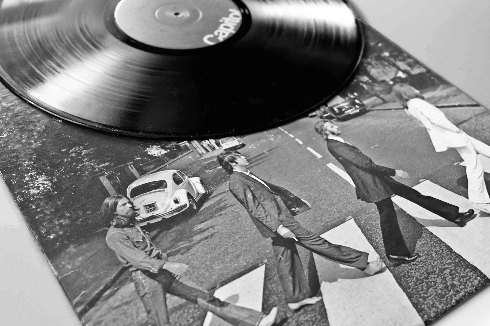
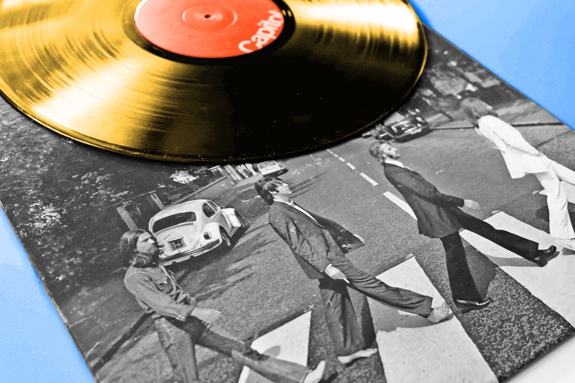
The Beatles: “Abbey Road” (1969)
Arguably the most famous album cover of all time, one that has been endlessly imitated and inspired countless tributes, Abbey Road is also quite simple. It consists of nothing more than all four Beatles walking across the eponymous street in front of the since-renamed EMI Recording Studios, where they recorded their last album together. Seven or eight different versions of the iconic photo were taken by Iain Macmillan on August 8, 1969, and he only had about 15 minutes to do so — that’s how long a police officer was willing to hold up traffic while Macmillan stood on a stepladder.
For all that, Abbey Road wasn’t the album’s original title. Everest was floated as a possibility, after the brand of cigarette that engineer Geoff Emerick smoked while it was being recorded, but the band balked when it was suggested that they travel to the Himalayas for the photo shoot. It’s also the first and only Beatles album not to feature their name (or that of the album) on the cover. John Kosh, who designed it, “insisted we didn’t need to write the band’s name on the cover” for the simple reason that “they were the most famous band in the world.” Well, he wasn’t wrong.
More Interesting Reads

Pink Floyd: “The Dark Side of the Moon” (1973)
Elsewhere in artwork that doesn’t feature the name of either the band or the album, Pink Floyd’s The Dark Side of the Moon may be the only album cover whose legacy gives Abbey Road a run for its money. Designed by Storm Thorgerson and Aubrey Powell of Hipgnosis, a design group that was also commissioned by everyone from Black Sabbath and Led Zeppelin to T. Rex and AC/DC, it depicts light being reflected into color by a glass prism. Six of the seven colors of the rainbow (red, orange, yellow, green, blue, and violet) are featured, with only indigo missing, but the more important number may be three. The prism, light beam, and color spectrum were apropos of the band’s iconic light shows as well as keyboardist Richard Wright’s suggestion to “do something clean, elegant and graphic.” Mission accomplished.

The Clash: “London Calling” (1979)
If this one reminds you of Elvis Presley, there’s a reason for that — it’s a direct callback. With lettering and colors too similar to have been a coincidence, London Calling’s artwork might never have been so iconic had it not been for an uncharacteristically quiet audience. The Clash performed at the Palladium in New York City in September of 1979, an event that was being photographed by Pennie Smith, when bassist Paul Simonon began smashing his bass to give the crowd something to react to.
“The Palladium had fixed seating, so the audience was frozen in place,” Simonon has said of that fateful gig. “We weren’t getting any response from them, no matter what we did. I’m generally good-natured, but I do bottle things up and then I’m like a light switch, off and on, and it can be quite scary, even for me, when I switch, because it’s very sudden. Onstage that night I just got so frustrated with that crowd and when it got to the breaking point I started to chop the stage up with the guitar.”

Joy Division: “Unknown Pleasures” (1979)
Here’s one that everyone has seen, even if they can’t instantly identify the band responsible for it. Many theories have been put forth as to the precise meaning behind Joy Division’s Unknown Pleasures — especially since it too features no text of any kind — from a heartbeat to a sound wave of some kind. The true answer: it’s a data visualization of the radio emissions from the first pulsar (also known as a rotating neutron star) ever discovered. Discovered by Cambridge student Jocelyn Bell Burnell in 1967, the pulsar was originally known as CP 1919 and its image was first published by Scientific American in January 1971.
Joy Division member Bernard Sumner happened upon the image after it was reprinted in The Cambridge Encyclopaedia of Astronomy, and it “clicked with [him] straight away” in part because it reminded him of Stanley Kubrick’s 2001: A Space Odyssey. Peter Saville, the in-house designer at Factory Records, was the one who decided for a white-on-black approach, which he felt “had more presence” than their black-on-white idea; 2019’s 40th-anniversary rerelease went with Joy Division’s original idea.

Nirvana: “Nevermind” (1991)
Few albums have altered the musical landscape quite like Nirvana’s 1991 breakthrough. In addition to grunge hits such as “Smells Like Teen Spirit” and “Come as You Are,” Nevermind is famous for its cover photograph of a nude baby swimming in a pool with a dollar on a fish hook just out of reach. Nirvana frontman Kurt Cobain conceived the idea after watching a television show about water births, leading Robert Fisher, the art director at Geffen Records, to seek out stock footage of water births that was eventually deemed too graphic. After the label balked at the prospect of paying $7,500 for a stock image of a swimming baby, photographer Kirk Weddle was tasked with taking photos at a nearby pool. Spencer Elden, whose picture ended up being used, was four months old at the time. Geffen hesitated to use the photo out of fears that it would be considered too explicit, but Cobain managed to change their minds.
The cover, and Elden’s part in it, hasn’t been without controversy. Elden filed a lawsuit against the remaining members of Nirvana in 2021 and sought $150,000 in damages, though the case was dismissed in January 2022.

The Smashing Pumpkins: “Mellon Collie and the Infinite Sadness” (1995)
Operatic in scope yet intimate in tone, the Smashing Pumpkins’ two-disc, 28-track magnum opus remains one of the most acclaimed albums of the 1990s. Its dreamlike beauty was captured perfectly by illustrator and collage artist John Craig, who Pumpkins frontman Billy Corgan asked to design the booklet illustrations. After being faxed concepts and ideas by Corgan, many of which ended up in a deluxe version of the album, Craig got to work — and, when the original idea for the cover art fell through, he asked, “Why don’t you give me a shot at the cover?”
Long tight-lipped about the inspiration behind the star-riding woman adorning the eventual cover, Craig has since admitted that she was a composite based on Jean-Baptiste Greuze’s The Souvenir (Fidelity) from 1787–1789 and Raphael’s Saint Catherine of Alexandria (circa 1507). He has also called it both “the CSI of album covers.”


