Amazon
When Amazon.com first launched in the 1990s, the company focused on books. Its initial logo had an image of the Amazon river, with a tagline saying, “Earth’s biggest bookstore.”
Of course, it’s been quite a while since Amazon sold only books. The company’s current logo debuted in 2000 and contains a message that reflects the company’s wide range of business interests. In the logo, which originally had “.com” appended to the end, an arrow swoops from the first “a” to the “z” to demonstrate that the company sells everything from A to Z. The arrow also looks like a smile to symbolize the ease and happiness the company wants customers to associate with shopping on Amazon.

Baskin-Robbins
While most other ice cream shops were selling vanilla, chocolate, and strawberry flavors, Baskin-Robbins thought that people deserved more options, and set out to have a different flavor for every day of the month. In 1945, founders Burt Baskin and Irv Robbins launched their ice cream store with 31 flavors of ice cream to choose from.
Baskin-Robbins has since created thousands of different flavors, but always makes sure to have 31 of them available to customers at any given time. In 2007, the company updated its branding, including a new logo with a large, pink-and-blue “BR.” The curved part of the “B” and the left line of the “R” are pink. Look at them together to see the number “31.”

Cisco
Cisco is a giant in the field of IT and networking, and at first glance, the light blue lines that float above the company’s name in the logo seem to be an appropriate choice for a digitally focused company. However, Cisco’s logo contains a hidden message about its origins. The company was founded in San Francisco (hence “Cisco”), and the lines are based on the shape of the Golden Gate Bridge.
More Interesting Reads

FedEx
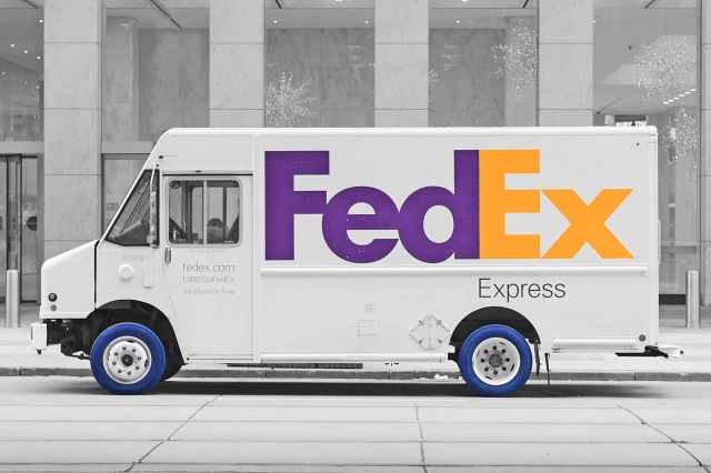
Federal Express began shipping products in 1971 and quickly became a household name. Its original logo was a box with “Federal Express” in white and red. As the brand gained popularity, it was shortened to “FedEx,” and its logo was adapted to fit the nickname.
The current FedEx logo has been around since 1994, and its hidden message is still relevant to the company’s business. Designer Lindon Leader shaped the negative space between the “E” and “x” into the shape of an arrow.
The FedEx logo has won several awards. Its development demonstrates that sometimes the best ideas take time. Leader said that when he started to work on the logo, the “farthest from our minds was the idea of an arrow.” But, he added, “after a few days, it dawned on me that if a genuine arrow could be introduced into the letterforms, it could subtly suggest getting from point A to point B reliably, with speed and precision.”

Hershey’s Kisses
Hershey Kisses were first produced in 1907; today, more than 70 million Hershey’s Kisses are made every single day. In addition to being one of America’s most popular candies, they are sold globally, so it’s safe to say that Kisses are just about everywhere — including in the logo. There’s a hidden kiss in the gap between the “K” and the “I.” If you need a little help seeing it, simply tilt your head to the left.

Levi’s
The Levi’s logo has a tie to the company’s long history. Since 1873, when Levi’s first started selling denim jeans, a double arc has been stitched onto the back pockets. The company has dubbed this shape “the arcuate,” which Levi’s began incorporating into its logo in 1967.
The logo, aka the “batwing,” has a straight line at the top like the back pocket of a pair of 501® jeans. The bottom of the logo is shaped like the arcuate, a nod to how integral the shape is to the company’s history.

The hidden message in the Pinterest logo can be found in the very first letter of its name. The straight line in the letter “P” is shaped like a pin. As Pinterest is an online pinboard site, this is an appropriate choice.
For Michael Deal, the co-designer of the logo, including a pin was perhaps too on the nose, and he initially shied away from incorporating one. But in the end, he couldn’t resist, explaining, “The ‘P’ started to lend itself too well to the shape of a map pin.”

Tostitos
Tostitos products include chips, salsas, and other dips. These items are often enjoyed at parties or with friends, so it’s not surprising that Tostitos wanted to include the concept of a friendly get-together in its logo. What’s notable is how subtly Tostitos incorporated the idea.
The dot over the “i” in the company’s name is a bowl of salsa, and above that is a tortilla chip. But it doesn’t stop there. On closer examination, the two “t’s” that surround the “i” look like two people enjoying chips and salsa.

Wendy’s
The Wendy’s logo gets a special mention for its hidden message. The company updated its logo in 2013, and in the redesign, pigtailed redhead Wendy appears slightly older and is wearing a new version of her blue and white outfit, with only the collar visible. The lines and waves on her collar spell out the word “mom.”
According to Wendy’s, this hidden message was not a planned one. After a design website pointed out the hidden word in July 2013, a Wendy’s executive stated, “We are aware of this and find it interesting that it appears our Wendy cameo has ‘mom’ on her ruffled collar. We can assure you it was unintentional.”


