Original photo by Teerapong Yovaga/ Shutterstock
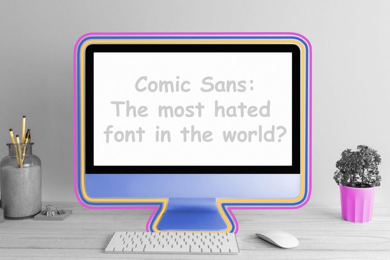
There are some things in modern culture that people just love to hate, like Nickelback, cargo pants, and the most derided typeface of all: Comic Sans. At first glance, this fun and childlike font — originally designed to mimic the script found in comic books — seems to serve a lighthearted purpose. But for more than a decade, it’s been derided as one of the worst typefaces ever. It turns out that Comic Sans doesn’t even hold a particularly warm and fuzzy place in its own creator’s heart — typographer Vincent Connare only used the font once in his life, in a letter complaining to his broadband internet provider.

Oops, incorrect!
It's a factAn italic typeface was introduced by Venetian printer Aldus Manutius in 1501. Manutius first used this slanted type in a printing of the works of Virgil, which he dedicated to Italy. Hence, the word “italics.”
Connare originally created the font for Microsoft Bob, a short-lived operating system designed to make computers more user-friendly. The desktop resembled a family room with icons representing certain computer programs. When someone clicked on a pen and paper icon, for example, it opened a word processor. Users were assisted by a cartoon dog named Rover, and during the software’s development, Connare decided that dogs “don’t talk in Times New Roman” — so he created Comic Sans. Although the final version of Microsoft Bob didn’t include the font, it appeared as an additional typeface in Windows 95.
Yet Comic Sans slowly garnered derision in the years following its initial release, and was often perceived as overly childish, visually chaotic, and an affront to good typeface design. Hate for the typeface drove reliable traffic on Twitter (now called X), inspired entire websites, and even prompted one vitriolic manifesto — but maybe times are changing. One reformed Comic Sans hater (and co-author of the aforementioned manifesto) changed his Facebook group “Ban Comic Sans” into “Use Comic Sans” in May 2019, telling The New York Times, “It’s gotten to be so bad that it’s almost cool again.”

Numbers Don't Lie
More Interesting Reads


The use of the word “sans” means the typeface is without ______.
Ready to reveal?
Confirm your email to play the next question?
The use of the word “sans” means the typeface is without serifs.

Movable type was invented in China — not Germany.
The invention of the printed word is often inexorably linked with 15th-century German printer Johannes Gutenberg and his press, but the first evidence of movable type — arranging separate letters on metal pieces — predates the Teutonic inventor by several centuries. Although the first printed (or at least not handwritten) books date back to the ninth century, the invention of movable type arrived in 11th-century China, as the creation of artisan and engineer Bi Sheng (970 to 1051 CE). To create this early printing press, Sheng hand-carved letters into clay and then baked them into reusable bricks. During the Nan (Southern) Song dynasty, which stretched from 1127 to 1279, these printed books helped create a scholar class in Chinese society, and the size of book collections became entwined with a person’s social status.

Darren Orf lives in Portland, has a cat, and writes about all things science and climate. You can find his previous work at Popular Mechanics, Inverse, Gizmodo, and Paste, among others.
top picks from the Inbox Studio network
Interesting Facts is part of Inbox Studio, an email-first media company. *Indicates a third-party property.